mui를 이용하여 Storybook을 만들어보자!
우선, 앞선 포스트에서 말했듯이 Storybook은 storybook을 실행시킬 시, 자동으로 .stories.tsx가 적혀진 파일명을 읽어 스토리북 웹에 띄워준다.
따라서 .stories.tsx 파일에 존재하는 내용들이 화면에 출력되게 되는 방식이다.
폴더 구조
Storybook을 다운 받게 되면 src 밑에 stories가 존재할텐데,
이 stories와 같은 곳으로 components를 하나 생성해준다.
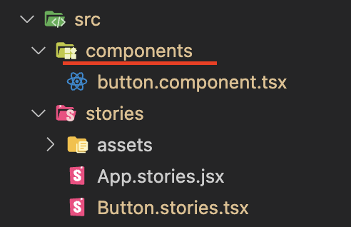
button.component.tsx
props들을 정의하는 곳
- 필요한 속성들을 mui에서 import 해온다.
-> 실제로 내가 사용할 속성들이 Button, ButtonProps이므로 Mui 속성의 Button, ButtonProps는 별칭으로 MuiButton, MuiButtonProps 등록해준다.import { Button as MuiButton, ButtonProps as MuiButtonProps, } from "@mui/material";
-> 속성 뒤에 Props는 mui에서 같이 속성이랑 제공되는 것 같다!
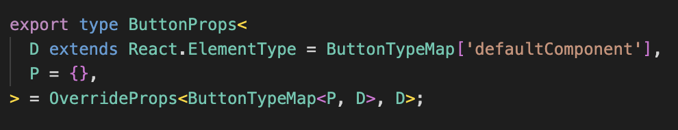
=> Mui Button 속성에 있는 코드 중 일부
-
Pick을 이용하여 가져오고자 하는 속성만 가져온다.
type ButtonBaseProps = Pick<MuiButtonProps, "variant" | "size" | "color">;-> 버튼의 속성 중에서 variant, size, color만 뽑아옴.
-
위에서 뽑은 ButtonBaseProps를 ButtonProps로 확장시킨다.
export interface ButtonProps extends ButtonBaseProps { label: string; }-> ButtonProps에 있던 variant, size, color에다가 label이 더해짐
4. Button 컴포넌트를 만든다.
export const Button = ({ label, ...rest }: ButtonProps) => (
<MuiButton {...rest}>{label}</MuiButton>); -> ...rest는 앞의 속성을 제외한 나머지 속성을 그대로 받아오는 것
-> 이렇게 하면 Button 컴포넌트 만들기 완성!
5. 마지막으로는 default 속성을 만들어준다.
Button.defaultProps = {
variant: "contained",
size: "medium",
color: "primary",
};최종 코드
import React from "react";
import {
Button as MuiButton,
ButtonProps as MuiButtonProps,
} from "@mui/material";
type ButtonBaseProps = Pick<MuiButtonProps, "variant" | "size" | "color">;
   export interface ButtonProps extends ButtonBaseProps {
 		label: string;
		}
export const Button = ({ label, ...rest }: ButtonProps) => (
<MuiButton {...rest}>{label}</MuiButton>
);
Button.defaultProps = {
 variant: "contained",
 size: "medium",
 color: "primary",
};Button.stories.tsx
이제 위에서 정의한 컴포넌트들을 가져와서 쓸 것이다
1. 각종 import
```
import React from "react";
import { ComponentStory, ComponentMeta } from "@storybook/react";
import Stack from "@mui/material/Stack";

import { Button } from "../components/button.component";
```
2. default => 어떤 컴포넌트의 Story인지 어떤 식으로 렌더링할지 정의
```
export default {
title: "Example/Button",
component: Button,
} as ComponentMeta;
```
<br/>
- title : storybook의 어디에 표시될 것인지 
=> Example/Button을 title로 지정하여서 Example 안의 Button에 들어가있는 것을 볼 수 있다.
- component : 무슨 컴포넌트를 사용할 것인지
```
위에 import {Button} 에서 Button을 가져옴
```
</br>
3. export const {이름} = ...
- 새로운 story를 만든다.
    export const Variants: ComponentStory<typeof Button> = () => (
  <Stack spacing={2} maxWidth={300}>
    <Button variant="text" label="Text Button" />
    <Button variant="contained" label="Contained Button" />
    <Button variant="outlined" label="Outlined Button" />
  </Stack>
	);
-> Variants라는 스토리가 만들어짐
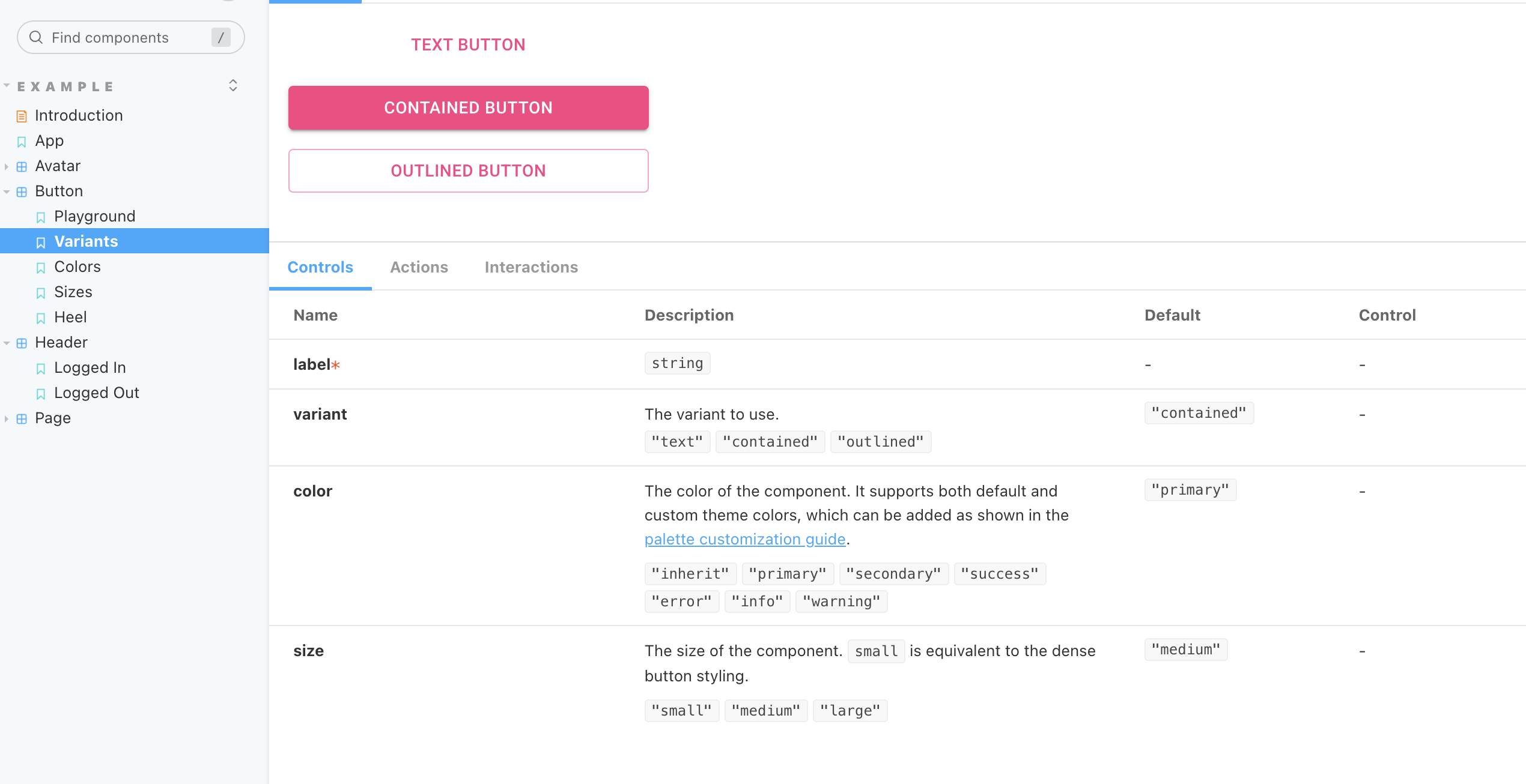
=> 이렇게 사용할 경우, storybook에서 args를 수정할 수가 없다.
4. Args
args를 다르게 부여해서 여러 개의 story를 재사용 할 수 있다.
const Template: ComponentStory<typeof Button> = (args) => <Button {...args} />;

export const Playground = Template.bind({});
Playground.args = {
  size: "small",
  label: "Click me!",
};
=> 값을 넣어주지 않으면 default값으로 들어가게 된다.
- 즉, size, label 외에 variant, color 속성도 있었는데 이것들은 default 값
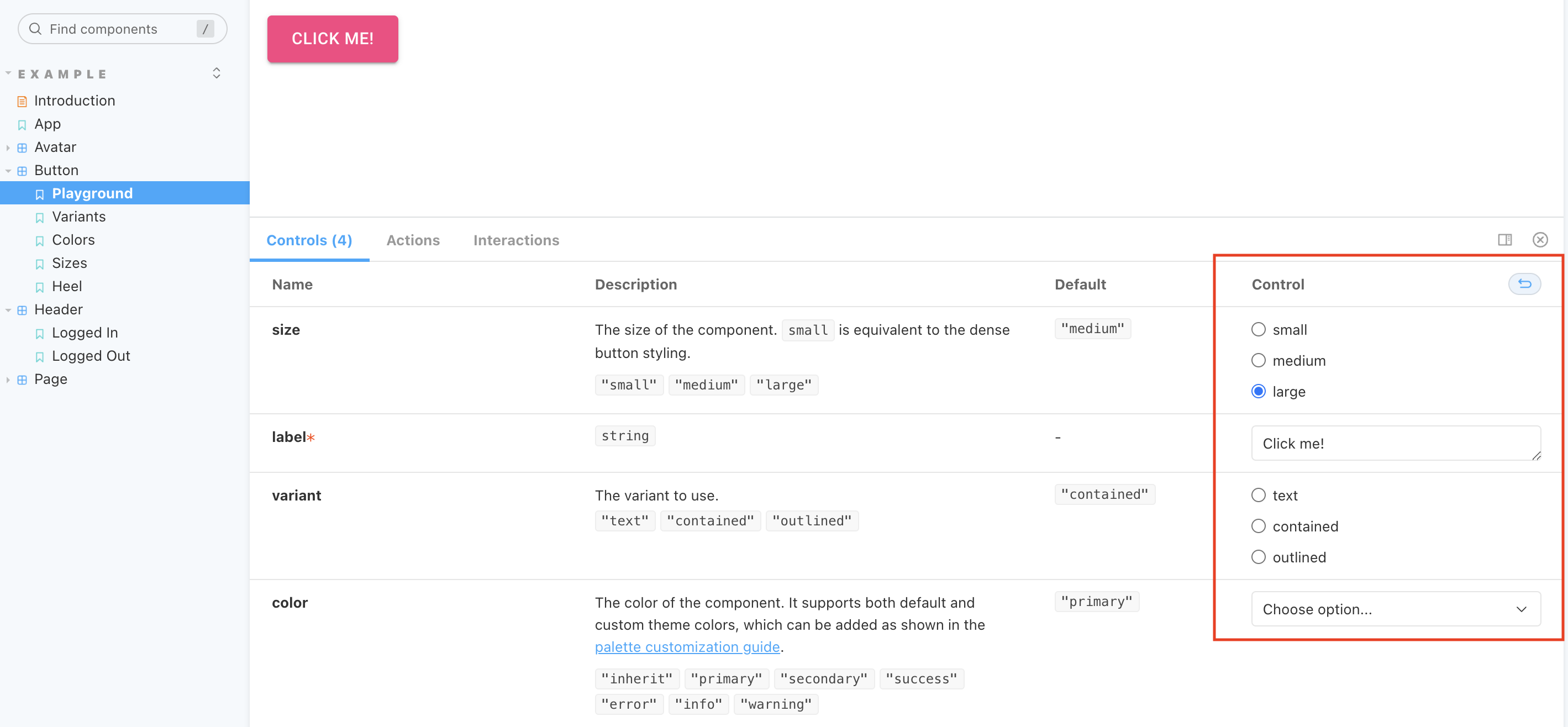
=> 위의 사진과 다르게 오른쪽에 Control이 생겨서 각각의 props들을 조작할 수 있는 것을 볼 수 있다.
최종 코드
import React from "react";
import { ComponentStory, ComponentMeta } from "@storybook/react";
import Stack from "@mui/material/Stack";

import { Button } from "../components/button.component";

export default {
  title: "Example/Button",
  component: Button,
} as ComponentMeta<typeof Button>;

const Template: ComponentStory<typeof Button> = (args) => <Button {...args} />;

export const Playground = Template.bind({});
Playground.args = {
  size: "small",
  label: "Click me!",
};

export const Variants: ComponentStory<typeof Button> = () => (
  <Stack spacing={2} maxWidth={300}>
    <Button variant="text" label="Text Button" />
    <Button variant="contained" label="Contained Button" />
    <Button variant="outlined" label="Outlined Button" />
  </Stack>
);

export const Colors: ComponentStory<typeof Button> = () => (
  <Stack spacing={2} maxWidth={300}>
    <Button variant="contained" label="Primary" />
    <Button variant="contained" color="secondary" label="Secondary" />
    <Button variant="contained" color="success" label="Success" />
    <Button variant="contained" color="error" label="Error" />
  </Stack>
);

export const Sizes: ComponentStory<typeof Button> = () => (
  <Stack spacing={2} maxWidth={300}>
    <Button variant="contained" size="small" label="Small" />
    <Button variant="contained" size="medium" label="Medium" />
    <Button variant="contained" size="large" label="Large" />
  </Stack>
);

export const Heel: ComponentStory<typeof Button> = () => (
  <Stack spacing={2} maxWidth={300}>
    <Button variant="contained" size="small" label="Small" />
    <Button variant="contained" size="medium" label="Medium" />
    <Button variant="contained" size="large" label="Large" />
  </Stack>
);

Hello Velog