styledComponent
javascript 에서 css를 사용할 수 있게 도와주는 라이브러리
-> css를 따로 페이지에 모아두는게 아니라 한 컴포넌트에 기능과 css를 같이 넣는 것이다.
✨ 사용 방법
- import
import styled from "styled-components";- 기본 문법 : styled.
원하는 HTML 태그
const ### = styled.div`
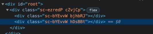
`;적용한 것 한눈에 보기
import styled from "styled-components";

//style
const Father = styled.div`
  display: flex;
`;

const BoxOne = styled.div`
  background-color: teal;
  width: 100px;
  height: 100px;
`;

const BoxTwo = styled.div`
  background-color: teal;
  width: 100px;
  height: 100px;
`;

const Text = styled.span `
  color: white;
`;

//js
function App() {
  return (
  <Father>
    <BoxOne />
      <Text>Hello</Text>
    <BoxTwo />
  </Father>
  );
}

export default App;
✨ 컴포넌트가 prop에 의해 변경 가능하게 만들기
const Box = styled.div`
  background-color: ${props => props.bgColor};
  width: 100px;
  height: 100px;
`;

function App() {
  return (
    <Father>
      <Box bgColor="teal" />
      <Box bgColor="tomato" />
    </Father>
  );
→ 클래스명 자동 생성
✨ styled(컴포넌트명)
style 속성이 중복될 때 복붙 없이 사용하기
const Box = styled.div`
  background-color: ${props => props.bgColor};
  width: 100px;
  height: 100px;
`;

const Circle = styled.div`
background-color: ${props => props.bgColor};
width: 100px;
height: 100px;
border-radius: 50px;
`;
원래 이렇게 중복해서 사용하던 코드를 아래처럼 줄일 수 있다
→
const Box = styled.div`
  background-color: ${props => props.bgColor};
  width: 100px;
  height: 100px;
`;

const Circle = styled(Box)`
  border-radius: 50px;
`;
✨ as="태그명"
컴포넌트의 태그는 바꾸고 싶은데 스타일은 유지하고 싶을 때
const Btn = styled.button`
  background-color: tomato;
  color: white;
`;


function App() {
  return (
    <Father>
      <Btn>Log in</Btn>
      <Btn as="a"></Btn>
    </Father>
  );
}
<button> → <a>
✨ styled.태그.attrs({})
태그의 속성 설정
const Input = styled.input.attrs({required : true, minLength: 10})`
  background-color: tomato;
`;

function App() {
  return (
    <Father>
      <Input />
      <Input />
      <Input />
    </Father>
  );
}
.attrs({}) 안에 input으로 전달될 모든 속성을 가진 오브젝트 담을 수 있음
✨ 애니메이션 주는 법
const rotationAnimation = keyframes`
  from {
    transform: rotate(0deg);
  }
  to {
    transform : rotate(360deg);
  }
`;

const Box = styled.div`
  height: 200px;
  width: 200px;
  background-color: tomato;
  animation: ${rotationAnimation} 1s linear infinite;
`;

function App() {
  return
    <Wrapper>
      <Box></Box>
    </Wrapper>;
}
➕) from-to 대신 %로 나타낼 수도 있다
const rotationAnimation = keyframes`
  0% {
    transform: rotate(0deg);
    border-radius: 0px;
  }
  50% {
    transform : rotate(360deg);
    border-radius: 100px;
  }
100% {
  transform: rotate(0deg);
    border-radius: 0px;
}
`;
✨ 컴포넌트 안에서 element 선택
const Box = styled.div`
  height: 200px;
  width: 200px;
  background-color: tomato;
  display:flex;
  justify-content: center;
  align-items: center;
  animation: ${rotationAnimation} 1s linear infinite;

//component 안에서 다른 component style 처리
  span {
    font-size: 36px;
  }
`;

function App() {
  return(
    <Wrapper>
      <Box>
        <span>^^</span>
      </Box>
    </Wrapper>
  );
}
모든 컴포넌트에 styled component 처리를 해주지 않아도 됨
하나의 컴포넌트만 styled 처리하고 다른 건 target 처리할 수 있음
✨ &:hover = span:hover
span {
    font-size: 36px;
    &:hover {
      font-size: 40px;
    }
  }
&로 표시 가능
➕) 컴포넌트 직접 타겟팅
${컴포넌트명} {
    font-size: 36px;
    &:hover {
      font-size: 40px;
    }
  }
🧩 Theme
- import
import
import { ThemeProvider} from 'styled-components';- ThemeProvider
//index.js
const darkTheme = {
  textColor: 'whitesmoke',
  backgroundColor: '#111',
}

const lightTheme = {
  textColor: '#111',
  backgroundColor: '#111whitesmoke',
}

ReactDOM.render(
  <React.StrictMode>
    <ThemeProvider theme={darkTheme}>
      <App />
    </ThemeProvider>
  </React.StrictMode>,
  document.getElementById('root')
);
ThemeProvider 안에 있는 (ex. App ) 모든 컴포넌트들은 그 안의 object에 접근 가능
ThemeProvider theme={darkTheme} -다크모드
ThemeProvider theme={lightTheme}> 라이트모드
//App.js
const Title = styled.h1`
  color: ${(props) => props.theme.textColor};
`;

const Wrapper = styled.div`
  display: flex;
  height: 100vh;
  width: 100vw;
  justify-content: center;
  align-items: center;
  background-color: ${(prop) => props.theme.backgroundColor};
`;

function App() {
  return(
    <Wrapper>
      <Title>Hello</Title>
    </Wrapper>
  );
}
주의 사항
render 안쪽에 Styled component를 선언해서는 안된다
-> 리렌더링 될 때 마다 요소를 새로 제작하기 때문
import React from 'react';
import styled from 'styled-components';

const AnyComponent = () => {
    // 절대 여기서 선언하면 안된다!
    const Button = styled.button`
        {button styles...};
    `;

    return (
        <Button>Bad!!!!</Button>
    );
}

return AnyComponent;
Reference
https://velog.io/@tastestar/Styled-Components
https://nomadcoders.co/react-masterclass/lobby
잘하자!