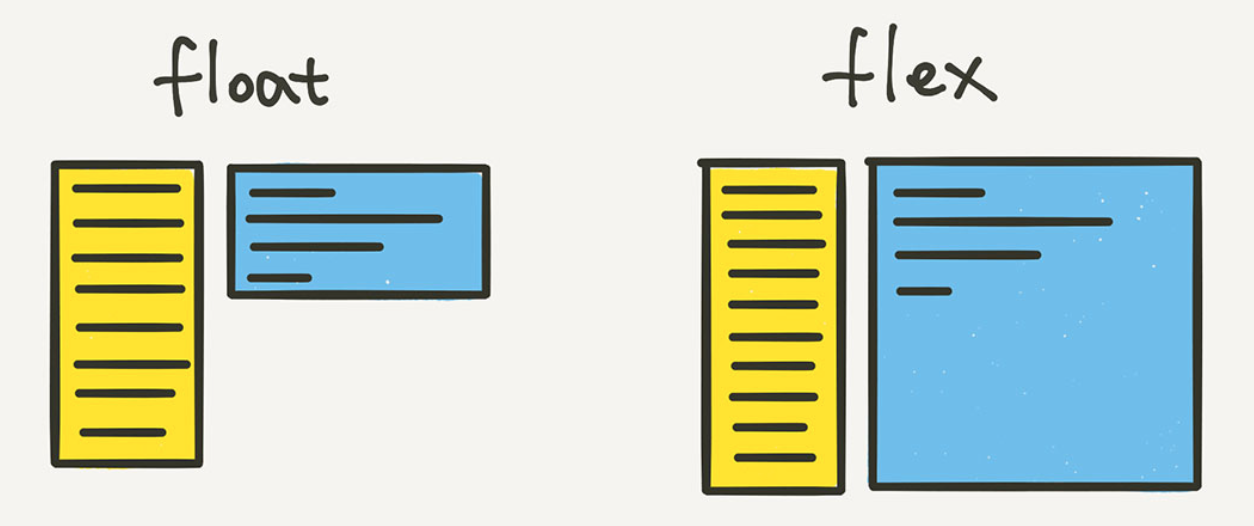
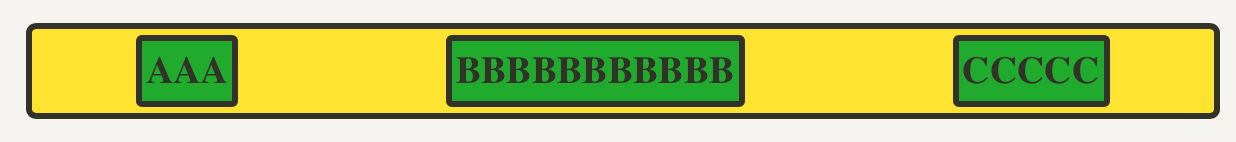
🧩 Flex 레이아웃 기본 구조
<div class="container">
	<div class="item">helloflex</div>
	<div class="item">abc</div>
	<div class="item">helloflex</div>
</div>
Flex Container (부모요소) : container
Flex Item (자식요소) : item
🧩 Container에 적용하는 속성
1. display: flex
.container {
	display: flex;
}
flex
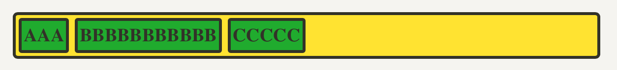
- 가로 방향으로 배치
- 자신이 가진 내용물의 width 만큼만 차지 (inline과 비슷)
- height는 컨테이너의 높이만큼 늘어난다
block
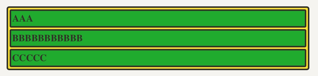
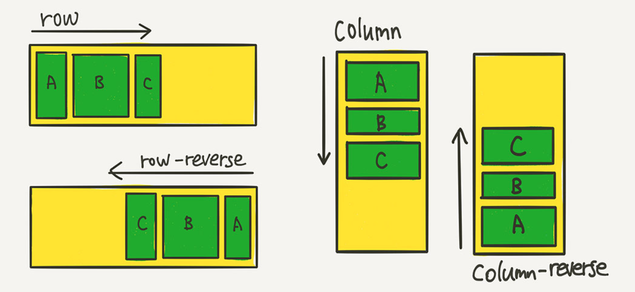
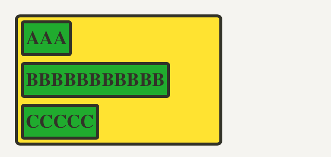
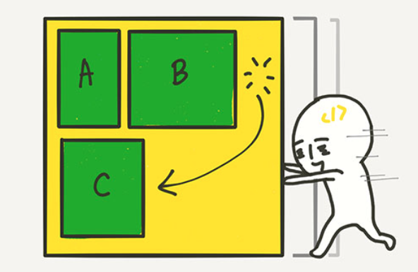
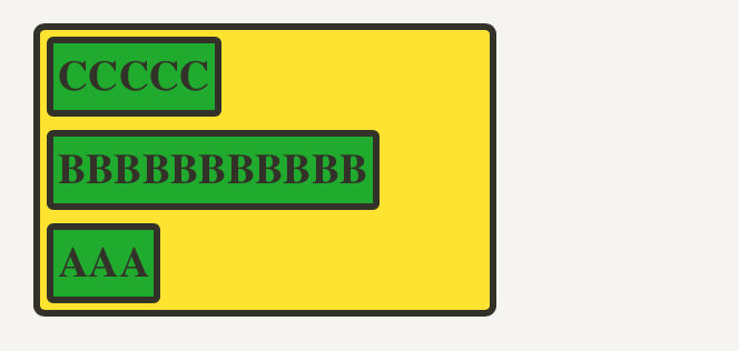
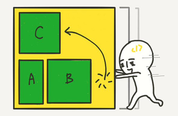
2. flex-direction 배치 방향 설정
아이템들이 배치되는 축의 방향을 결정하는 속성
.container {
	flex-direction: row;
	/* flex-direction: column; */
	/* flex-direction: row-reverse; */
	/* flex-direction: column-reverse; */
}
3. flex-wrap 줄넘김 처리 설정
.container {
	flex-wrap: nowrap;
	/* flex-wrap: wrap; */
	/* flex-wrap: wrap-reverse; */
}-
nowrap(기본값)
줄바꿈 ❌, 넘치면 삐져나감

-
wrap
줄바꿈, float이나 inline-block으로 배치한 요소들과 비슷하게 동작
wrap-reverse
줄바꿈 + 아이템 역순 배치
4 (2+3). flex-flow
flex-direction과 flex-wrap을 한꺼번에 지정
.container {
	flex-flow: row wrap;
	/* 아래의 두 줄을 줄여 쓴 것 */
	/* flex-direction: row; */
	/* flex-wrap: wrap; */
}
5. 정렬
justify는 메인축(가로) 방향으로 정렬
align은 수직축(세로) 방향으로 정렬
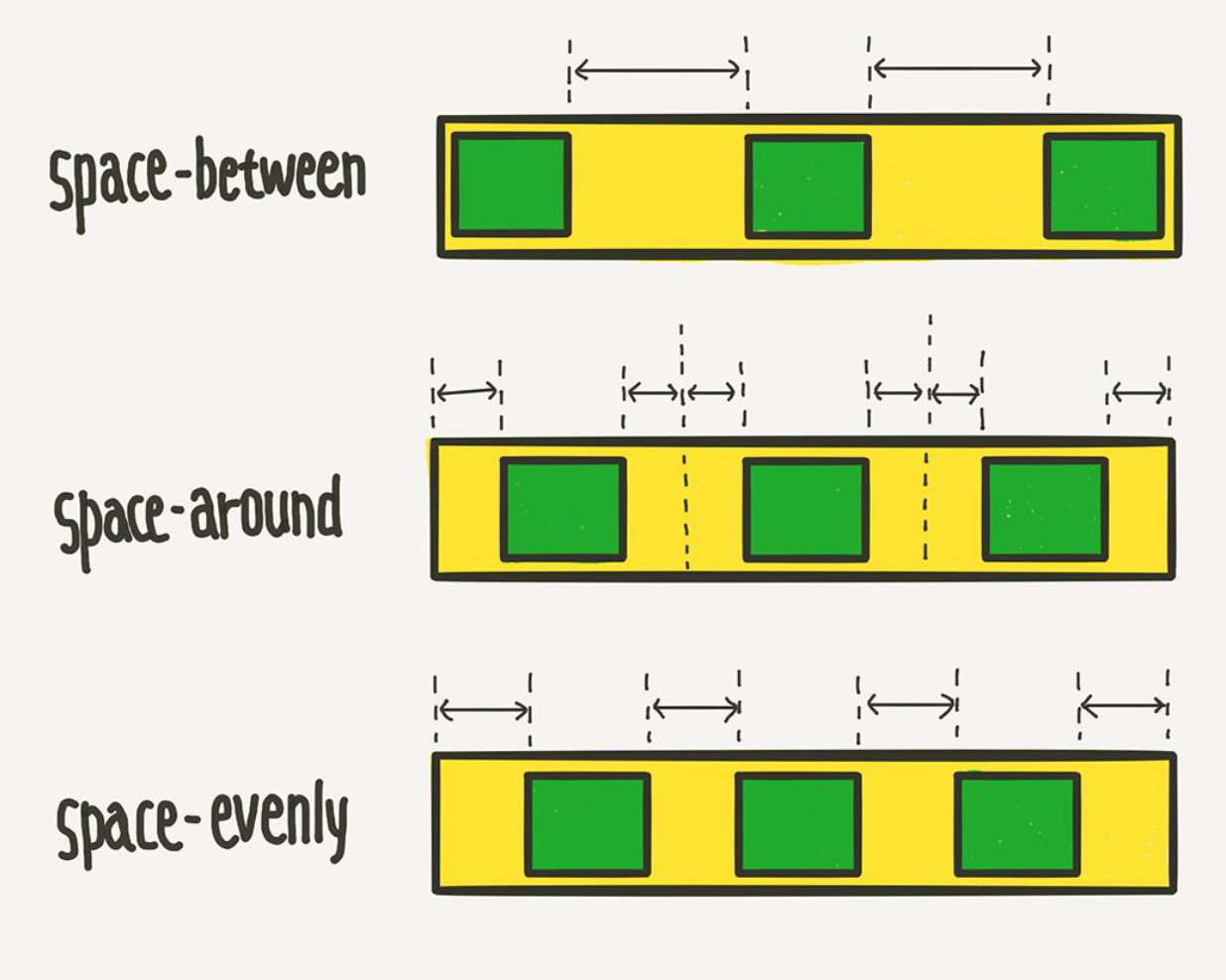
↔️justify-content 메인축 방향 정렬
.container {
	justify-content: flex-start;
	/* justify-content: flex-end; */
	/* justify-content: center; */
	/* justify-content: space-between; */
	/* justify-content: space-around; */
	/* justify-content: space-evenly; */
}
flex-start : flex-direction이 row(가로 배치)일 때는 왼쪽, column(세로 배치)일 때는 위

flex-end

space-between : 균일한 간격

space-around : 둘레에 균일한 간격
↕️align-items 수직축 방향 정렬
.container {
	align-items: stretch;
	/* align-items: flex-start; */
	/* align-items: flex-end; */
	/* align-items: center; */
	/* align-items: baseline; */
}
stretch(기본값) : 아이템들이 수직축 방향으로 끝까지 늘어남

✨ 가운데 정렬
display: flex;
justify-content: center;
align-item: center;
Reference
https://studiomeal.com/archives/197
잘하자!