FlexBox 정복하기 1
flex box를 생성하고
(display: flex;),
요소들의 방향을 설정해주고(flex-direction),
요소들을 다음줄로 넘겨주는 방법(flex-wrap)까지 알아보자.
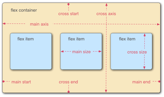
MDN에서 가져온 flex model
1. 기본 코드 만들고 시작 !
오늘 사용한 기본 코드는 아래와 같다.
기본 html코드
<!DOCTYPE html>
<html lang="en">
<head>
    <meta charset="UTF-8">
    <meta name="viewport" content="width=device-width, initial-scale=1.0">
    <title>flex box 연습</title>
    <link rel="stylesheet" href="index2.css">
</head>
<body>
    <div class="container">
        <div class="item item1">1</div>
        <div class="item item2">2</div>
        <div class="item item3">3</div>
        <div class="item item4">4</div>
        <div class="item item5">5</div>
        <div class="item item6">6</div>
        <div class="item item7">7</div>
        <div class="item item8">8</div>
        <div class="item item9">9</div>
        <div class="item item10">10</div>
    </div>
</body>
</html>
기본 css코드
.container {
  background-color: beige;
  height: 100vh;
}

.item {
  width: 80px;
  height: 80px;
}
.item1 {
  background-color: #ffcdd2;
}

.item2 {
  background-color: #e1bee7;
}

.item3 {
  background-color: #d1c4e9;
}

.item4 {
  background-color: #bbdefb;
}

.item5 {
  background-color: #b2ebf2;
}

.item6 {
  background-color: #c8e6c9;
}

.item7 {
  background-color: #fff9c4;
}

.item8 {
  background-color: #ffe0b2;
}

.item9 {
  background-color: #ffccbc;
}

.item10 {
  background-color: #f5f5f5;
}
위와 같이 html과 css파일을 만들어주면 아래와 같이 예쁜 무지개 박스가 생성된다. 🌈
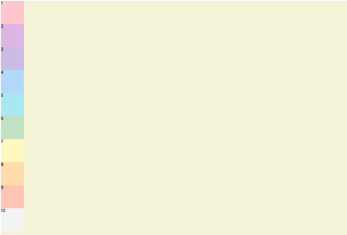
2. flex box 생성
flex box 모델을 시작하려면 display: flex;로 먼저 시작을 알려주면 된다.
/* flex box 시작!*/
.container {
background-color: beige;
height: 100vh;
display: flex;
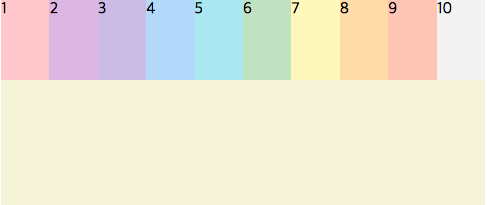
}그럼 이렇게 촤르륵 옆으로 붙는다.

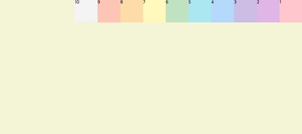
(1) flex-direction
flex-direction은 요소의 방향을 잡아 줄수 있다.
(기본값)flex-direction: row;
flex-direction: row-reverse; 무지개박스가 기본방향에서 반대편은 오른쪽에서 시작된다.
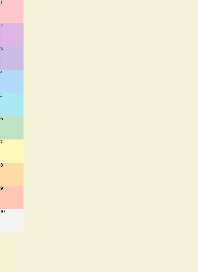
flex-direction: column; 축의 수직 방향으로 무지개 박스의 방향 변경!
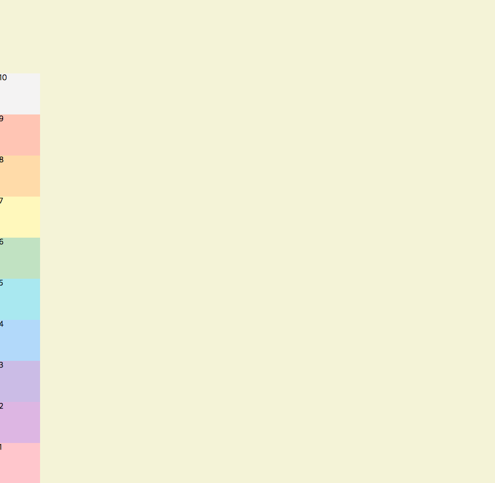
flex-direction: column-reverse; 축의 수직방향이되 기본 값이 위 아래 > 아래 위로 방향 변경!
(2) flex-wrap
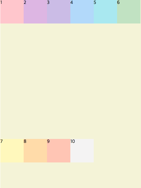
기본값인flex-wrap: nowrap;상태에서는 브라우져 창을 줄이면 무지개 요소들이 창에 맞춰 작아진다.
flex-wrap: wrap;
이떄, flex-wrap: wrap;을 사용하면 브라우져가 줄어들어도 무지개 요소들이 원래 사이즈를 유지하며 부족한 공간만큼 다음 줄로 무지개 요소를 이동시켜준다.
참고링크
https://velog.io/@dev_cecy 로 벨로그 옮겼습니다👻❣️