
⚡ 컴포넌트 연습 6
📌 Modal
-
페이지 내 이벤트를 통해 별도의 페이지 이동 없이 팝업창으로 보여주는 컴포넌트
-
Modal의 특성상 body의 가장 최상위에 위치해야하는데 이 때 react portal을 이용한다.
💡 ReactDom.createPortal
첫 번째로 DOM을 받고 두 번째로 넣을 element를 받아서 이용한다.
element는 해당 DOM의 최상위에서 작동한다. -
useClickAway 훅을 이용하여 팝업창 바깥을 누르거나 닫기 버튼을 누르면 나갈 수 있다.
💻 Modal/index.js
이전에 제작한 useClickAway 훅을 사용한다.
import styled from "@emotion/styled";
import { useEffect, useMemo } from "react";
import  ReactDOM  from "react-dom";
import useClickAway from "../../hooks/useClickAway";

const BackgroundDim = styled.div`
    position: fixed;
    top: 0;
    left: 0;
    width: 100vw;
    height: 100vh;
    background-color: rgba(0, 0, 0, 0.5);
    z-index: 1000;
`

const ModalContainer = styled.div`
    position: fixed;
    top: 50%;
    left: 50%;
    transform: translate(-50%, -50%);
    padding: 8px;
    background-color: white;
    box-shadow: 0 3px 6px rgba(0, 0, 0, 0.2);
    box-sizing: border-box;
`

const Modal = ({
    children,
    width = 500,
    height,
    visible = false,
    onClose,
    ...props
}) => {
    const ref = useClickAway(() => {
        onClose && onClose();
    });

    const containerStyle = useMemo(() => ({
        width,
        height
    }), [width, height])

    const el = useMemo(() => document.createElement('div'), []);
    useEffect(() => {
        document.body.appendChild(el);
        return () => {
            document.body.removeChild(el);
        }
    })

    return ReactDOM.createPortal(
        <BackgroundDim style={{ display: visible ? "block" : "none" }}>
            <ModalContainer ref={ref} {...props} style={{...props.style, ...containerStyle}}>
                {children}
            </ModalContainer>
        </BackgroundDim>,
        el
    )
}

export default Modal;
💻 Modal.stories.js
import { useState } from "react";
import Modal from "../../components/Modal";

export default {
    title: 'Component/Modal',
    component: Modal
}

export const Default = () => {
    const [visible, setVisible] = useState(false);

    return (
        <div>
            <button onClick={() => setVisible(true)}>Show Modal</button>
            <Modal visible={visible} onClose={() => setVisible(false)}>
                <h1>어서 와</h1>
                <button onClick={() => setVisible(false)}>닫기</button>
            </Modal>
        </div>
    )
}
🖨 완성된 컴포넌트
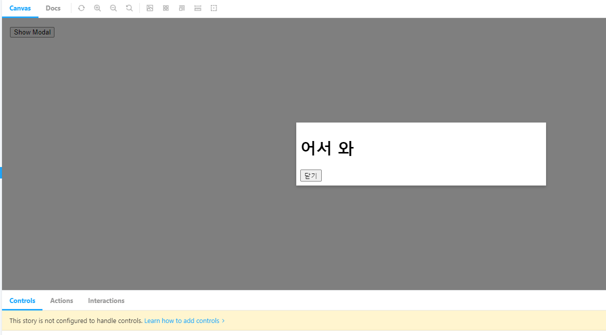
useClickAway 훅을 이용하였기 때문에 팝업창의 바깥을 눌러도 팝업창을 나갈 수 있다.
📌 Toast
-
알림을 띄울 때 사용하는 컴포넌트
-
jsx가 아닌 별도 클래스를 통해 즉시 띄우는 컴포넌트이다.
-
ReactDOM.render을 이용한다.
💡 createPortal은 원하는 위치에 컴포넌트를 넣는 용도, render는 포탈 자체를 출력
-
이전에 제작한 useTimeout 훅을 이용하여 일정 시간이 지나면 알림이 사라진다.
💻 Toast/ToastItem.js
import Text from '../Text'
import useTimeout from '../../hooks/useTimeout';
import styled from '@emotion/styled';
import { useState } from 'react';

const Container = styled.div`
    position: relative;
    display: flex;
    width: 450px;
    height: 70px;
    padding: 0 20px;
    align-items: center;
    border-radius: 4px;
    border-top-left-radius: 0;
    border-top-right-radius: 0;
    border: 1px solid #ccc;
    background-color: white;
    box-shadow: 0 1px 3px rgba(0, 0, 0, 0.2);
    box-sizing: border-box;
    opacity: 1;
    transition: opacity 0.4s ease-out;

    &:first-of-type {
        animation: move 0.4s ease-out forwards;
    }

    &:not(:first-of-type) {
        margin-top: 8px;
    }

    @keyframes move {
        0% {
            margin-top: 80px;
        }
        100% {
            margin-top: 0;
        }
    }
`;

const ProgressBar = styled.div`
    position: absolute;
    top: 0;
    left: 0;
    width: 0;
    height: 4px;
    background-color: #44b;
    animation-name: progress;
    animation-timing-function: linear;
    animation-fill-mode: forwards;

    @keyframes progress {
        0% {
            width: 0%;
        }
        100% {
            width: 100%;
        }
    }
`

const ToastItem = ({ id, message, duration, onDone }) => {
    const [show, setShow] = useState(true);

    useTimeout(() => {
        setShow(false);
        setTimeout(() => onDone(), 400)
    }, duration);

    return (
        <Container style={{opacity: show ? 1 : 0}}>
            <ProgressBar style={{ animationDuration: `${duration}ms` }} />
            <Text>{message}</Text>
        </Container>
    )
}

export default ToastItem;
💻 Toast/ToastManager.js
import styled from "@emotion/styled";
import { useCallback, useEffect, useState } from "react";
import { v4 } from 'uuid';
import ToastItem from "./ToastItem";

const Container = styled.div`
    position: fixed;
    top: 16px;
    right: 16px;
    z-index: 1500;
`

const ToastManager = ({ bind }) => {
    const [toasts, setToasts] = useState([]);

    const createToast = useCallback((message, duration) => {
        const newToast = {
            id: v4(),
            message,
            duration
        };
        setToasts((oldToasts) => [...oldToasts, newToast]);
    }, []);

    const removeToast = useCallback((id) => {
        setToasts((oldToasts) => oldToasts.filter(toast => toast.id !== id))
    }, []);

    useEffect(() => {
        bind(createToast);
    }, [bind, createToast]);

    return (
        <Container>
            {toasts.map(({ id, message, duration }) => (
                <ToastItem
                    id={id}
                    message={message}
                    duration={duration}
                    key={id}
                    onDone={() => removeToast(id)}
                ></ToastItem>
            ))}
        </Container>
    )
}

export default ToastManager;
💻 Toast/index.js
import ReactDOM from "react-dom";
import ToastManager from "./ToastManager";

class Toast {
    portal = null;

    constructor() {
        const portalId = 'toast-portal';
        const portalElement = document.getElementById(portalId);

        if(portalElement) {
            this.portal = portalElement;
            return;
        } else {
            this.portal = document.createElement('div');
            this.portal.id = portalId;
            document.body.appendChild(this.portal);
        }

        ReactDOM.render(
            <ToastManager
                bind={(createToast) => {
                    this.createToast = createToast;
                }}
            />,
            this.portal
        );
    }

    show(message, duration = 2000) {
        this.createToast(message, duration);
    }
}

export default new Toast();
💻 Toast.stories.js
import Toast from "../../components/Toast"

export default {
    title: 'Component/Toast'
}

export const Default = () => {
    return (
        <button onClick={() => Toast.show("안녕!", 3000)}>Show Toast</button>
    );
}
🖨 완성된 컴포넌트
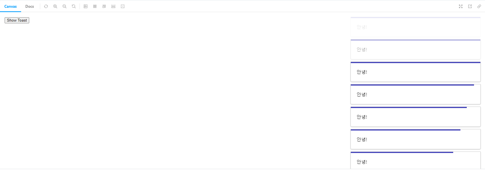
CSS animation을 이용하여 매끄럽게 알람이 사라진다.
컴포넌트 제작도 우선은 이것으로 마무리하였다.
확장성에 신경을 많이 썼지만 많은 컴포넌트들이 CSS적인 부분에서 좀 더 건드렸어도 괜찮았겠다는 생각이 든다.
추후에 더 추가하거나 수정할 일이 있을 때 계속 건드릴 예정이다.

Hodie mihi, Cras tibi