
⚡ 컴포넌트 연습 5
📌 Divider
- 요소들을 위아래로 나누거나 좌우로 나누는 컴포넌트
💻 Divider/index.js
import styled from "@emotion/styled";

const Line = styled.hr`
    border: none;
    background-color: #aaa;

    &.vertical {
        position: relative;
        top: -1;
        display: inline-block;
        width: 1px;
        height: 13px;
        vertical-align: middle;
    }

    &.horizontal {
        display: block;
        width: 100%;
        height: 1px;
    }
`

const Divider = ({
    type = "horizontal", // 수평, 수직
    size = 8,
    ...props
}) => {
    const dividerStyle = {
        margin:
            type === 'vertical' ? `0 ${size}px` : `${size}px 0`,
    }

    return (
        <Line
            {...props}
            className={type}
            style={{...dividerStyle, ...props.style}}
        />
    )
}

export default Divider;
💻 Divider.stories.js
import Divider from "../../components/Divider"
import Text from "../../components/Text"
export default {
title: 'Component/Divider',
component: Divider,
};
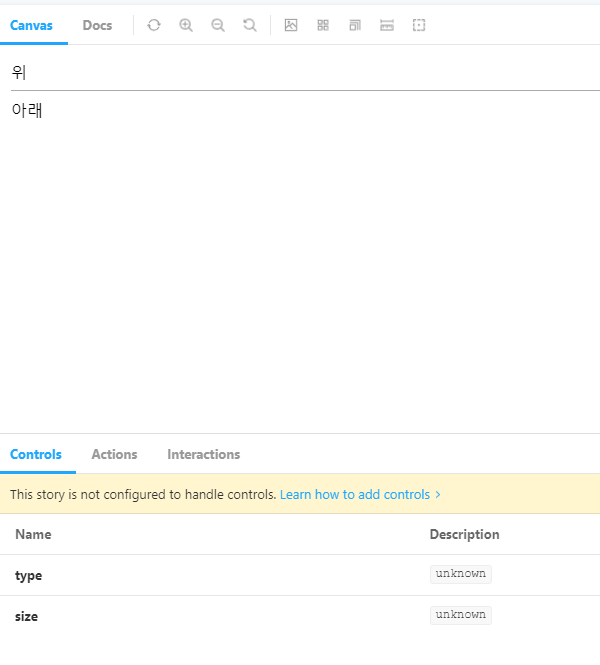
export const Horizontal = () => {
return (
<>
<Text>위</Text>
<Divider type="horizontal"></Divider>
<Text>아래</Text>
</>
)
}
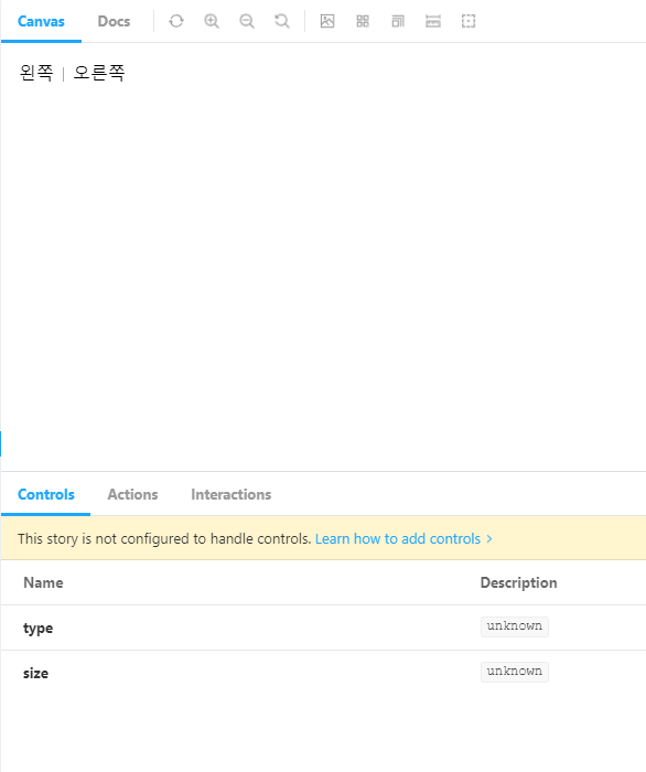
export const vertical = () => {
return (
<>
<Text>왼쪽</Text>
<Divider type="vertical"></Divider>
<Text>오른쪽</Text>
</>
)
}🖨 완성된 컴포넌트
📌 Skeleton
-
로딩을 보여줄 때 사용, 스피너와는 다르게 이곳에 다른 컨텐츠가 있음을 직관적으로 보여준다.
-
아이콘이나 텍스트 등이 있음을 보여주기 위해 박스형, 원형, 문장형으로 나누어 제작한다.
-
Base 컴포넌트를 기반으로 제작하며 제작한 컴포넌트들은 index.js에서 넘겨받는다.
💻 Skeleton/Base.js
import styled from "@emotion/styled";

const Base = styled.div`
    display: inline-block;
    border-radius: 4px;
    background-image: linear-gradient(
        90deg,
        #dfe4e8 0px,
        #efefef 40px,
        #dfe3e8 80px
    );
    background-size: 200% 100%;
    background-position: 0 center;
    animation: skeleton--zoom-in 0.2s ease-out,
        skeleton--loading 2s infinite linear;

    @keyframes skeleton--zoom-in {
        0% {
            opacity: 0;
            transform: scale(0.95)
        }
        100% {
            opacity: 1;
            transform: scale(1);
        }
    }

    @keyframes skeleton--loading {
            0% {
                background-position-x: 100%;
            }
            50% {
                background-position-x: -100%;
            }
            100% {
                background-position-x: -100%;
            }
    }
`;

export default Base;
💻 Skeleton/Box.js
import styled from "@emotion/styled";
import Base from "./Base";

const Box = styled(Base)`
    width: ${({width}) => typeof width === 'number' ? `${width}px` : width};
    height: ${({height}) => typeof height === 'number' ? `${height}px` : height};
`;

export default Box;
💻 Skeleton/Circle.js
import styled from "@emotion/styled";
import Base from "./Base";

const Circle = styled(Base)`
    width: ${({size}) => typeof size === 'number' ? `${size}px` : size};
    height: ${({size}) => typeof size === 'number' ? `${size}px` : size};
    border-radius: 50%;
`;

export default Circle;
💻 Skeleton/Paragraph.js
import Box from "./Box";

const Paragraph = ({ line =3, ...props}) => {
    return (
        <div {...props}>
            {Array.from(Array(line), (_, index) =>
                index !== line - 1 ? (
                    <Box width="100%" height={16} key={index} />
                ) : (
                    <Box width="64%" height={16} key={index} />
                )
            )}
        </div>
    )
};

export default Paragraph;
💻 Skeleton/index.js
import Box from './Box';
import Circle from './Circle';
import Paragraph from './Paragraph';

const Skeleton = {
    Box,
    Circle,
    Paragraph,
};

export default Skeleton;
💻 Skeleton.stories.js
import Skeleton from "../../components/Skeleton";
export default {
title: 'Component/Skeleton',
};
export const Box = (args) => <Skeleton.Box {...args} />;
Box.argTypes = {
width: { defaultValue: 200, control: 'number' },
height: { defaultValue: 100, control: 'number' },
};
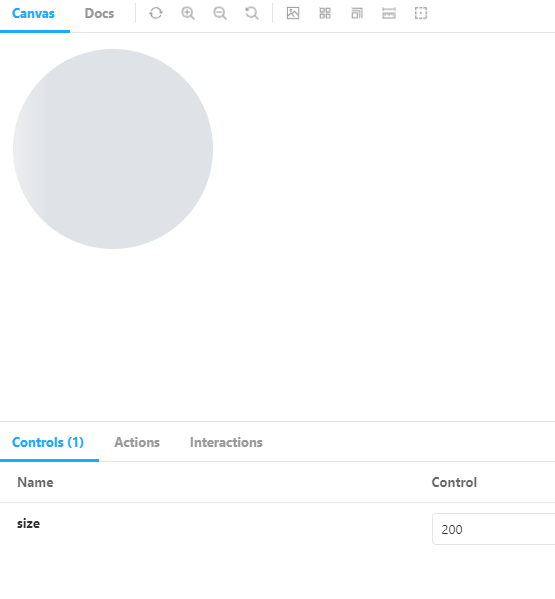
export const Circle = (args) => <Skeleton.Circle {...args} />;
Circle.argTypes = {
size: { defaultValue: 200, control: 'number' },
};
export const Paragraph = (args) => <Skeleton.Paragraph {...args} />;
Paragraph.argTypes = {
size: { line: 3, control: 'number' },
};
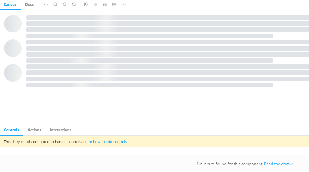
export const Sample = () => {
return (
<>
<div style={{ float: 'left', marginRight: 16}}>
<Skeleton.Circle size={60} />
</div>
<div style={{ float: 'left', width: '80%'}}>
<Skeleton.Paragraph line={4} />
</div>
<div style={{ clear: "both" }} />
<div style={{ float: 'left', marginRight: 16}}>
<Skeleton.Circle size={60} />
</div>
<div style={{ float: 'left', width: '80%'}}>
<Skeleton.Paragraph line={4} />
</div>
<div style={{ clear: "both" }} />
<div style={{ float: 'left', marginRight: 16}}>
<Skeleton.Circle size={60} />
</div>
<div style={{ float: 'left', width: '80%'}}>
<Skeleton.Paragraph line={4} />
</div>
<div style={{ clear: "both" }} />
</>
)
}🖨 완성된 컴포넌트
📌 Flux
-
레이아웃을 쉽게 만들기 위해 사용
-
Row, Col로 이루어져 있다.
-
Context를 이용한 Gutter 속성으로 요소 간의 간격을 조절할 수 있다.
-
offset과 span 속성을 이용해 요소가 차지하는 영역을 조절할 수 있다.
💻 Flux/FluxProvider.js
import { createContext, useContext } from "react";

const FluxContext = createContext();
export const useFlux = () => useContext(FluxContext);

const FluxProvider = ({ children, gutter = 0 }) => {
    return (
        <FluxContext.Provider value={{gutter}}>{children}</FluxContext.Provider>
    )
};

export default FluxProvider;
💻 Flux/Col.js
import styled from "@emotion/styled";
import { useMemo } from "react";
import { useFlux } from "./FluxProvider";

const StyledCol = styled.div`
    max-width: 100% fit-content;
    box-sizing: border-box;

    width: ${({span}) => span && `${(span/12)*100}%`};
    margin-left: ${({offset}) => offset && `${(offset/12)*100}%`};
`

const Col = ({ children, span, offset, ...props }) => {
    const { gutter } = useFlux();
    const gutterStyle = useMemo(() => {
        if(Array.isArray(gutter)) {
            const horizontalGutter = gutter[0];
            const verticalGutter = gutter[1];
            return {
                paddingTop: `${verticalGutter/2}px`,
                paddingBottom: `${verticalGutter/2}px`,
                paddingLeft: `${horizontalGutter/2}px`,
                paddingRight: `${horizontalGutter/2}px`,
            }
        } else {
            return {
                paddingLeft: `${gutter/2}px`,
                paddingRight: `${gutter/2}px`,
            }
        }
    }, [gutter]);

    return (
        <StyledCol
            {...props}
            span={span}
            offset={offset}
            style={{...props.style, ...gutterStyle}}
        >
            {children}
        </StyledCol>
    )
};

export default Col;
💻 Flux/Row.js
import styled from "@emotion/styled";
import { useMemo } from "react";
import FluxProvider from "./FluxProvider";

const AlignToCSSValue = {
    top: 'flex-start',
    middle: 'center',
    bottom: 'flex-end'
}

const StyledRow = styled.div`
    display: flex;
    flex-direction: row;
    flex-wrap: wrap;
    box-sizing: border-box;

    justify-content: ${({justify}) => justify};
    align-items: ${({align}) => AlignToCSSValue[align]};
`;

const Row = ({ children, justify, align, gutter, ...props }) => {
    const gutterStyle = useMemo(() => {
        if(Array.isArray(gutter)) {
            const horizontalGutter = gutter[0];
            const verticalGutter = gutter[1];
            return {
                marginTop: `-${verticalGutter/2}px`,
                marginBottom: `-${verticalGutter/2}px`,
                marginLeft: `-${horizontalGutter/2}px`,
                marginRight: `-${horizontalGutter/2}px`,
            }
        } else {
            return {
                marginLeft: `-${gutter/2}px`,
                marginRight: `-${gutter/2}px`,
            }
        }
    }, [gutter]);

    return (
        <FluxProvider gutter={gutter}>
            <StyledRow
                {...props}
                align={align}
                justify={justify}
                style={{...props.style, ...gutterStyle}}
            >{children}</StyledRow>
        </FluxProvider>
    );
};

export default Row;
💻 Flux/index.js
import Row from "./Row";
import Col from "./Col";

const Flux = {
    Row, Col
};

export default Flux;
💻 Flux.stories.js
import Flux from "../../components/Flux";
const { Row, Col } = Flux;
export default {
title: 'Component/Flux',
component: Flux
};
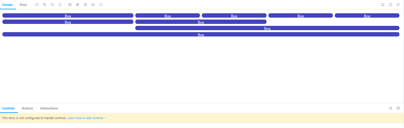
const Box = () => {
return (
<div style={{
backgroundColor: '#44b',
width: '100%',
height: 18,
color: 'white',
textAlign: "center",
borderRadius: 8,
}}
>
Box
</div>
)
}
export const Default = () => {
return (
<Row gutter={[8, 8]}>
<Col span={4}><Box /></Col>
<Col span={2}><Box /></Col>
<Col span={2}><Box /></Col>
<Col span={2}><Box /></Col>
<Col span={2}><Box /></Col>
<Col span={4}><Box /></Col>
<Col span={4}><Box /></Col>
<Col offset={4} span={8}><Box /></Col>
<Col span={12}><Box /></Col>
</Row>
)
}🖨 완성된 컴포넌트
📌 Breadcrumb
-
현재 사용자가 어떤 경로를 거쳐 어디에 위치해있는지 알려준다.
-
경로 중 하나를 누르면 해당 위치에 붙어있는 링크를 통해 그 경로로 이동할 수 있다.
-
현재 위치는 더 굵은 글씨로 표시되며 꺽쇠는 더 붙지 않는다.
💻 Breadcrumb/BreadcrumbItem.js
Text에 이어 이전의 Icon 컴포넌트를 사용하였다.
import styled from '@emotion/styled';
import Text from '../Text';
import Icon from '../Icon';

const BreadcrumbItemContainer = styled.div`
    display: inline-flex;
    align-items: center;
`

const Anchor = styled.a`
    color: inherit;
    text-decoration: none;
`

const BreadcrumbItem = ({ children, href, active, __TYPE, ...props }) => {
    return (
        <BreadcrumbItemContainer {...props}>
            <Anchor href={href}>
                <Text size={14} strong={active}>
                    {children}
                </Text>
            </Anchor>
            { !active && <Icon name="chevron-right" size={22} strokeWidth={1}></Icon> }
        </BreadcrumbItemContainer>
    );
};

BreadcrumbItem.defaultProps = {
    __TYPE: "BreadcrumbItem",
};

BreadcrumbItem.propTypes = {
    __TYPE: "BreadcrumbItem",
};

export default BreadcrumbItem;
💻 Breadcrumb/index.js
import styled from "@emotion/styled";
import React from "react";
import BreadcrumbItem from "./BreadcrumbItem";

const BreadcrumbContainer = styled.nav`
    display: inline-block;
`;

const Breadcrumb = ({ children, ...props }) => {
    const items = React.Children.toArray(children).filter((element) => {
        if(
            React.isValidElement(element) &&
            element.props.__TYPE === "BreadcrumbItem"
        ) {
            return true;
        }

        console.warn("Only accepts Breadcrumb.Item as it's children.")
        return false;
    })
    .map((element, index, elements) => {
        return React.cloneElement(element, {
            ...element.props,
            active: index === elements.length -1.
        });
    });

    return (
        <BreadcrumbContainer>
            {items}
        </BreadcrumbContainer>
    )
}

Breadcrumb.Item = BreadcrumbItem;

export default Breadcrumb;
💻 Breadcrumb.stories.js
import Breadcrumb from "../../components/Breadcrumb"

export default {
    title: 'Component/Breadcrumb',
    component: Breadcrumb,
};

export const Default = () => {
    return (
            <Breadcrumb>
                <Breadcrumb.Item href="/home">Home</Breadcrumb.Item>
                <Breadcrumb.Item href="/level1">Level 1</Breadcrumb.Item>
                <Breadcrumb.Item>Level 2</Breadcrumb.Item>
                <Breadcrumb.Item>Level 3</Breadcrumb.Item>
            </Breadcrumb>
    )
}
🖨 완성된 컴포넌트

📌 Tab
-
페이지 이동 없이 컨텐츠를 스위칭하기 위해 사용하는 컴포넌트
-
Breadcrumb나 Avatar와 같이 타입 검증 이후 컴포넌트가 출력된다.
💡 여기서는 리팩터링하였다.
-
탭 안에 이동할 페이지를 넣으면 어느 페이지든 출력된다.
💻 Tab/TabItem.js
import styled from '@emotion/styled';
import PropTypes from 'prop-types';
import Text from '../Text';


const TabItemWrapper = styled.div`
    display: inline-flex;
    align-items: center;
    justify-content: center;
    width: 140px;
    height: 60px;
    background-color: ${({active}) => active ? '#ddf' : '#eee'};
    cursor: pointer;
`

const TabItem = ({ title, index, active, ...props }) => {
    return (
        <TabItemWrapper active={active} {...props}>
            <Text strong={active}>{title}</Text>
        </TabItemWrapper>
    )
}

TabItem.defaultProps = {
    __TYPE: "Tab.Item",
};

TabItem.propTypes = {
    __TYPE: PropTypes.oneOf(["Tab.Item"]),
};

export default TabItem;
💻 Tab/index.js
import styled from "@emotion/styled";
import React, { useMemo, useState } from "react";
import TabItem from "./TabItem";

const childrenToArray = (children, types) => {
    return React.Children.toArray(children).filter(element => {
        if(React.isValidElement(element) && types.includes(element.props.__TYPE)) {
            return true;
        }

        console.warn(`Only accepts ${Array.isArray(types) ? types.join(', ') : types} as it's children.`)
        return false;
    })
}

const TabItemContainer = styled.div`
    border-bottom: 2px solid #ddd;
    background-color: #eee;
`

const Tab = ({ children, active, ...props }) => {
    const [currentActive, setCurrentActive] = useState(() => {
        if(active) {
            return active;
        } else {
            const index = childrenToArray(children, 'Tab.Item')[0].props.index;
            return index;
        }
    });

    const items = useMemo(() => {
        return childrenToArray(children, 'Tab.Item').map(element => {
            return React.cloneElement(element, {
                ...element.props,
                key: element.props.index,
                active: element.props.index === currentActive,
                onClick: () => {
                    setCurrentActive(element.props.index);
                }
            })
        })
    }, [children, currentActive])

    const activeItem = useMemo (
        () => items.find(element => currentActive === element.props.index),
        [currentActive, items]
    );

    return (
        <div>
            <TabItemContainer>{items}</TabItemContainer>
            <div>{activeItem.props.children}</div>
        </div>
    );
};

Tab.Item = TabItem;

export default Tab;
💻 Tab.stories.js
import Tab from "../../components/Tab"
import Header from "../../components/Header"
export default {
title: 'Component/Tab',
component: Tab,
};
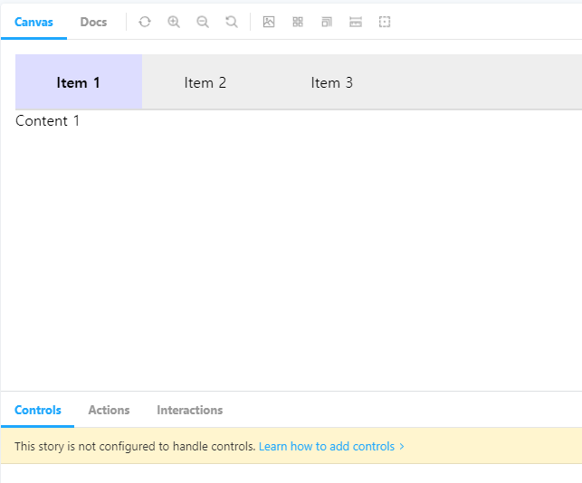
export const Default = () => {
return (
<Tab>
<Tab.Item title="Item 1" index="item1">Content 1</Tab.Item>
<Tab.Item title="Item 2" index="item2">Content 2</Tab.Item>
<Tab.Item title="Item 3" index="item3">
<Header>Header</Header>
</Tab.Item>
</Tab>
)
}
🖨 완성된 컴포넌트

다음 시간에는 사용자 훅을 공부할 예정인데
그 전에 훅과 컴포넌트 분리를 위해 폴더를 따로 구분하였으니 참고하길 바란다.