Udemy Web Developer Bootcamp Section 10
Responsive CSS & Flexbox
Flexbox
Flexbox is a one-dimensional layout method for laying out items in rows or columns.
Flexbox is a recent addtion to CSS, included to address common layout frustations.
Flexbox allows us to distribute space dynamically across elememts of an unknown size, hence the term "flex".
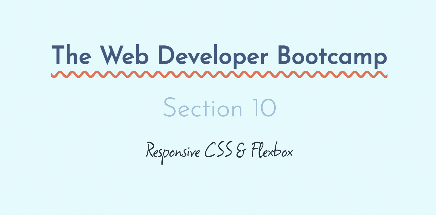
Flex-Direction
Flex Direction allows us to decide on the main axis direction in our container. So default is flex direction row.
#container {
    background-color: #003049;
    width: 90%;
    height: 500px;
    margin: 0 auto;
    border: 5px solid #003049;
    display: flex;
    flex-direction: column-reverse;
}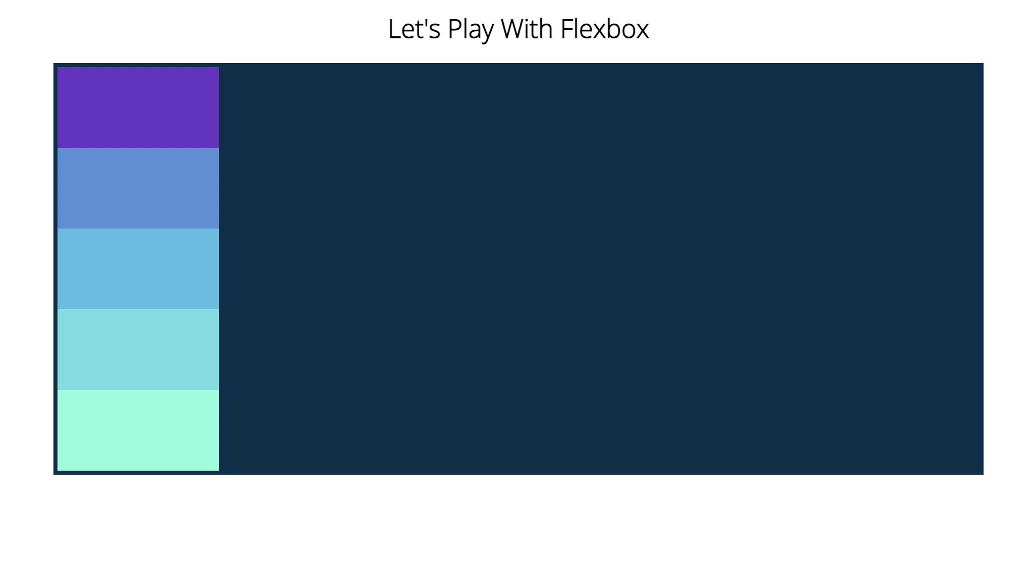
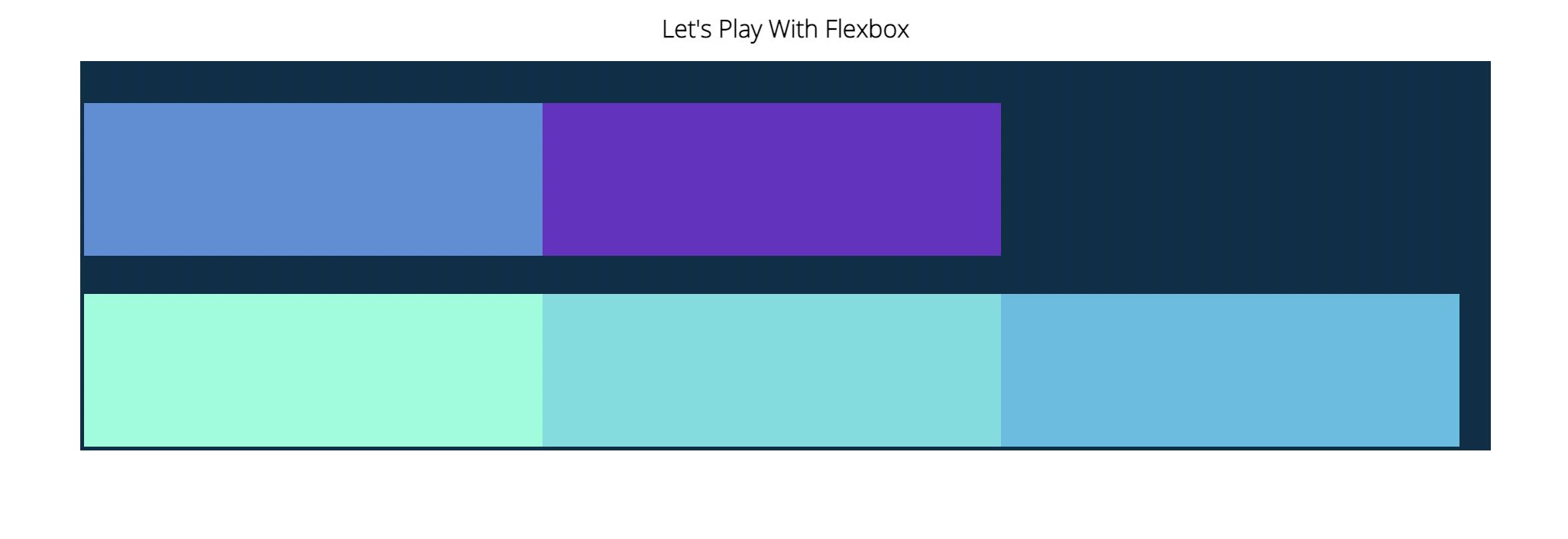
Justify-Content
#container {
    background-color: #003049;
    width: 90%;
    height: 500px;
    margin: 0 auto;
    border: 5px solid #003049;
    display: flex;
    flex-direction: row;
    justify-content: space-between;
}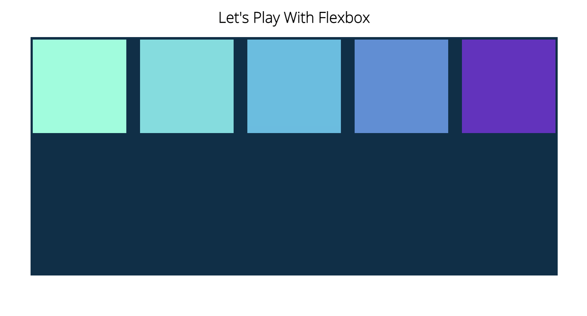
Flex-Wrap
Flex-Wrap determines whether our elements are going to rap along the main axis onto a new line if it's horizontal or a new column if it's a vertical axis.
#container {
    background-color: #003049;
    width: 90%;
    height: 500px;
    margin: 0 auto;
    border: 5px solid #003049;
    display: flex;
    flex-direction: column;
    justify-content: flex-start;
    flex-wrap: wrap;
}

#container div {
    width: 600px;
    height: 200px;
}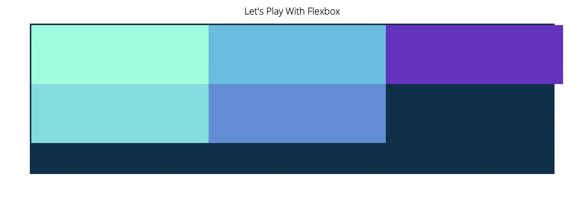
#container {
    background-color: #003049;
    width: 90%;
    height: 500px;
    margin: 0 auto;
    border: 5px solid #003049;
    display: flex;
    flex-direction: row;
    justify-content: flex-start;
    flex-wrap: wrap-reverse;
}

#container div {
    width: 600px;
    height: 200px;
}
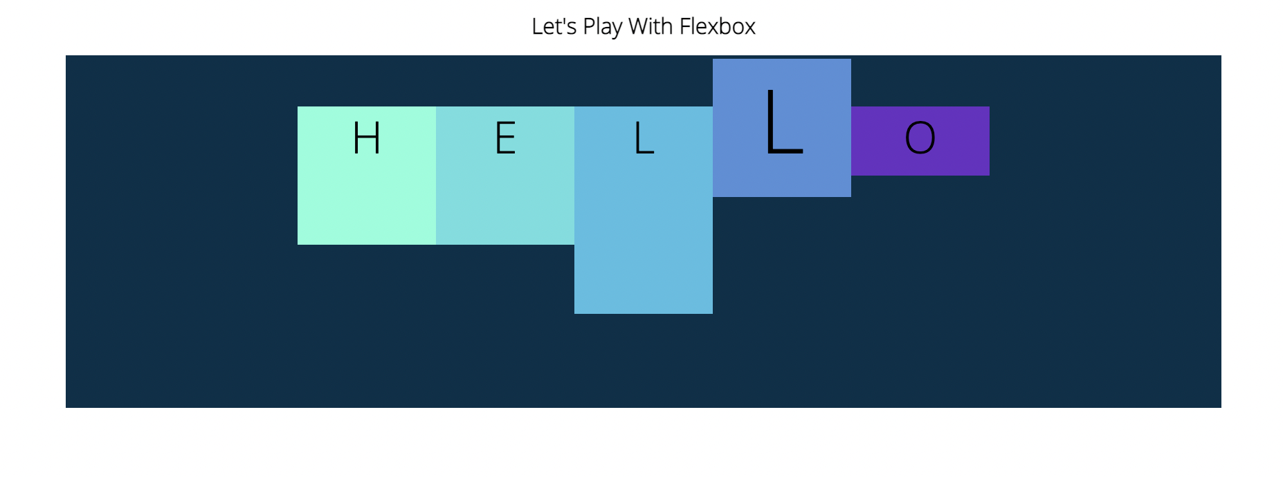
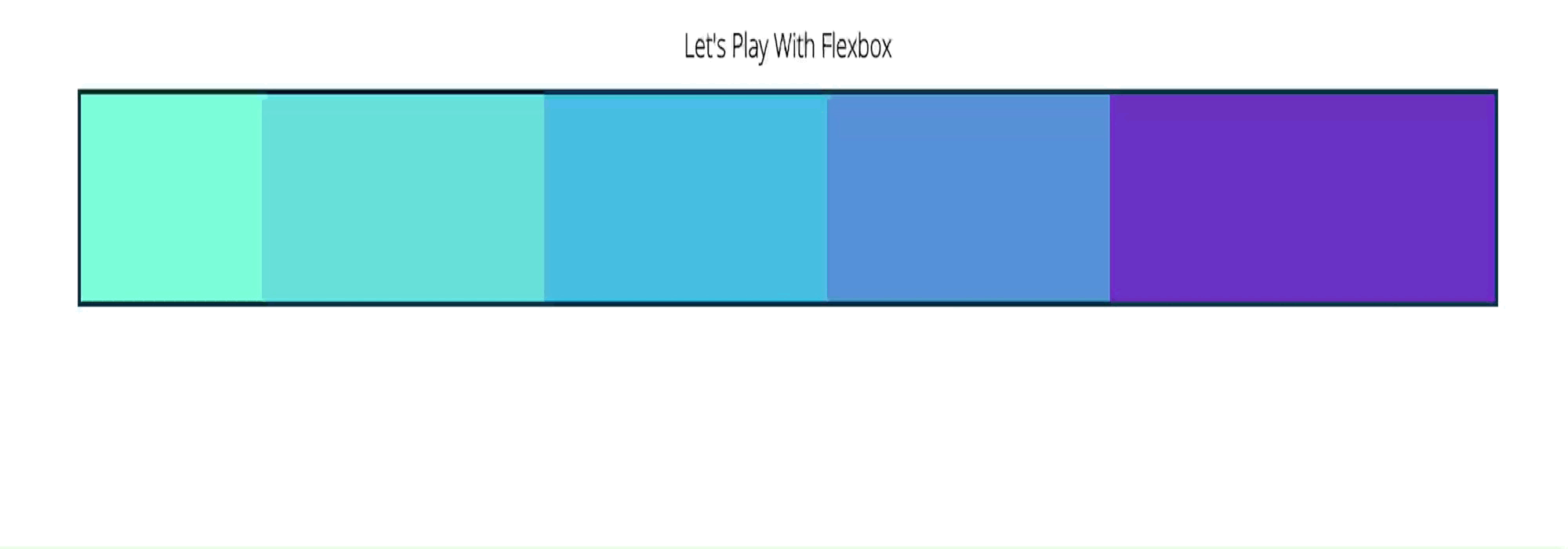
Align-Items
<section id="container">
  <div style="background-color: #80ffdb">H</div>
  <div style="background-color: #64dfdf">E</div>
  <div style="background-color: #48bfe3; height: 300px;">L</div>
  <div style="background-color: #5390d9; font-size: 8em;">L</div>
  <div style="background-color: #6930c3; height: 100px;">O</div>
</section>
#container {
background-color: #003049;
width: 90%;
height: 500px;
margin: 0 auto;
border: 5px solid #003049;
display: flex;
flex-direction: row;
justify-content: center;
align-items: baseline;
}
#container div {
width: 200px;
height: 200px;
text-align: center;
font-size: 4em;
}
#container {
    background-color: #003049;
    width: 90%;
    height: 500px;
    margin: 0 auto;
    border: 5px solid #003049;
    display: flex;
    flex-direction: column;
    justify-content: center;
    align-items: flex-end;
    flex-wrap: wrap;
}
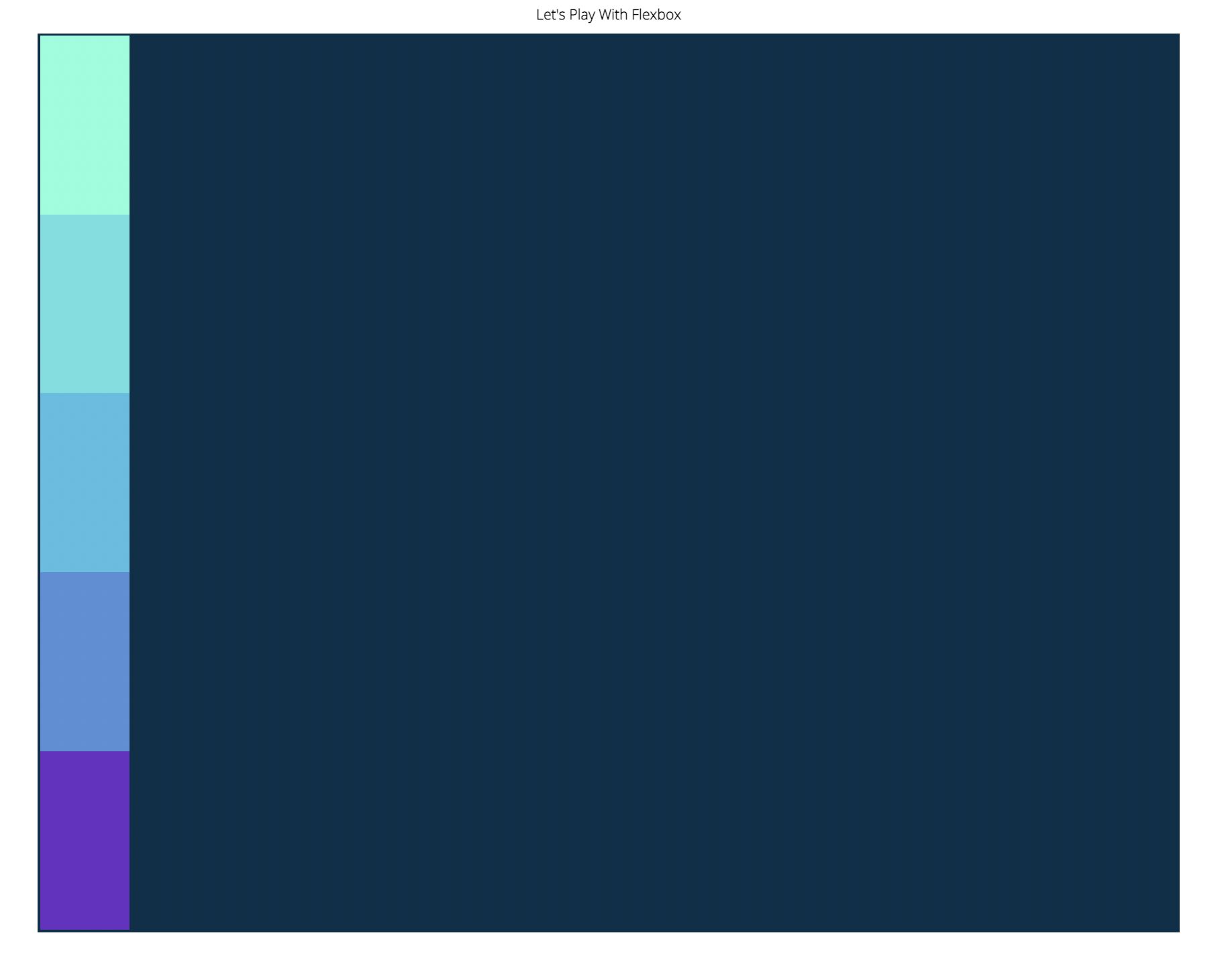
#container {
    background-color: #003049;
    width: 90%;
    height: 500px;
    margin: 0 auto;
    border: 5px solid #003049;
    display: flex;
    flex-direction: column;
    justify-content: center;
    align-items: flex-start;
    flex-wrap: wrap-reverse;
}
Align-Content & Align-Self
#container {
    background-color: #003049;
    width: 90%;
    height: 500px;
    margin: 0 auto;
    border: 5px solid #003049;
    display: flex;
    flex-direction: column;
    justify-content: center;
    align-items: flex-end;
    flex-wrap: wrap;
    align-content: space-between;
}
#container {
    background-color: #003049;
    width: 90%;
    height: 500px;
    margin: 0 auto;
    border: 5px solid #003049;
    display: flex;
    flex-direction: row;
    justify-content: center;
    align-items: flex-end;
    flex-wrap: wrap;
    align-content: center;
}

#container div {
    width: 600px;
    height: 200px;
}
#container {
    background-color: #003049;
    width: 90%;
    height: 500px;
    margin: 0 auto;
    border: 5px solid #003049;
    display: flex;
    flex-direction: row;
    justify-content: center;
    align-items: flex-start;
    flex-wrap: wrap;
}

#container div {
    width: 200px;
    height: 200px;
}

div:nth-of-type(2) {
    align-self: center;
}

div:nth-of-type(3) {
    align-self: flex-end;
}
#container {
    background-color: #003049;
    width: 90%;
    height: 500px;
    margin: 0 auto;
    border: 5px solid #003049;
    display: flex;
    flex-direction: column;
    justify-content: center;
    align-items: flex-end;
    flex-wrap: wrap;
}

div:nth-of-type(5) {
    align-self: flex-start;
}
Flex-Basis, Grow & Shrink
- Flex-basis
Defines the initial size of an element before addtional space is distributed. - Flex-grow
Controls the amount of available space an element should take up. Accepts a unit-less number value. - Flex-shrink
If items are larger than the container, they shrink according to flex-shrink.
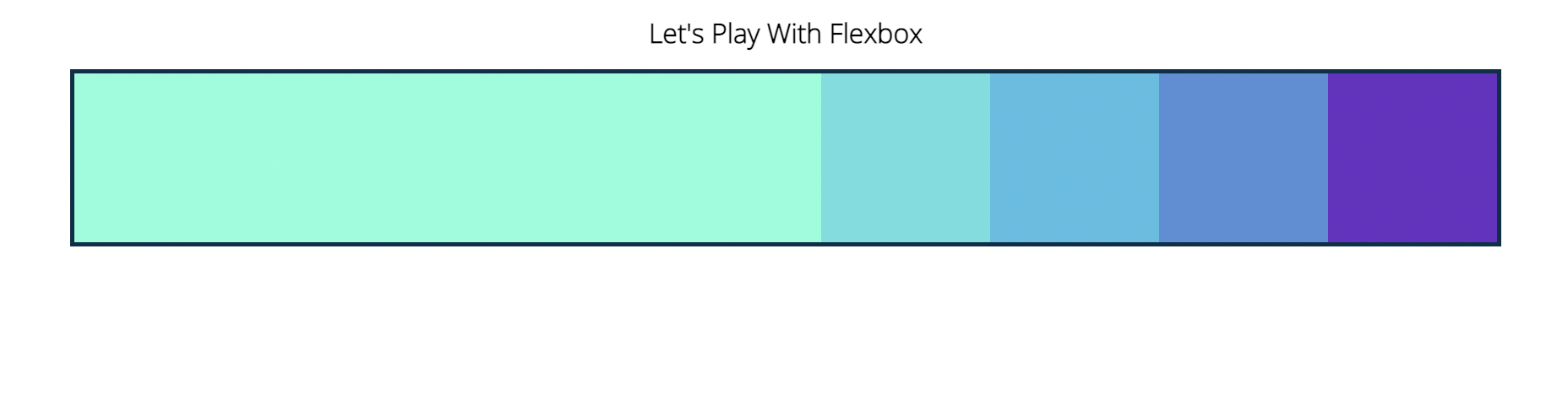
#container {
    background-color: #003049;
    width: 90%;
    /* height: 500px; */
    margin: 0 auto;
    border: 5px solid #003049;
    display: flex;
    flex-direction: row;
    justify-content: center;
    flex-wrap: wrap;
}

#container div {
    width: 200px;
    height: 200px;
    flex-basis: 400px;
}
#container {
    background-color: #003049;
    width: 90%;
    /* height: 500px; */
    margin: 0 auto;
    border: 5px solid #003049;
    display: flex;
    flex-direction: column;
    justify-content: center;
    flex-wrap: wrap;
}

#container div {
    width: 200px;
    height: 200px;
    flex-basis: 400px;
}
#container {
    background-color: #003049;
    width: 90%;
    /* height: 500px; */
    margin: 0 auto;
    border: 5px solid #003049;
    display: flex;
    flex-direction: row;
    justify-content: center;
    flex-wrap: wrap;
}

#container div {
    width: 200px;
    height: 200px;
    flex-basis: 200px;
}

div:nth-of-type(1) {
    flex-grow: 1;
}
#container {
    background-color: #003049;
    width: 90%;
    /* height: 500px; */
    margin: 0 auto;
    border: 5px solid #003049;
    display: flex;
    flex-direction: row;
    justify-content: center;
    flex-wrap: wrap;
}

#container div {
    width: 200px;
    height: 200px;
    max-width: 300px;
    flex-basis: 200px;
    flex-grow: 1;

}

div:nth-of-type(1) {
    flex-grow: 1;
}
#container {
    background-color: #003049;
    width: 90%;
    /* height: 500px; */
    margin: 0 auto;
    border: 5px solid #003049;
    display: flex;
    flex-direction: row;
    justify-content: center;
    /* flex-wrap: wrap; */
}

#container div {
    width: 200px;
    height: 200px;
    flex-basis: 600px;
}

div:nth-of-type(1) {
    flex-grow: 1;
    flex-shrink: 2;
}

div:nth-of-type(5) {
    flex-grow: 2;
    flex-shrink: 0;
}
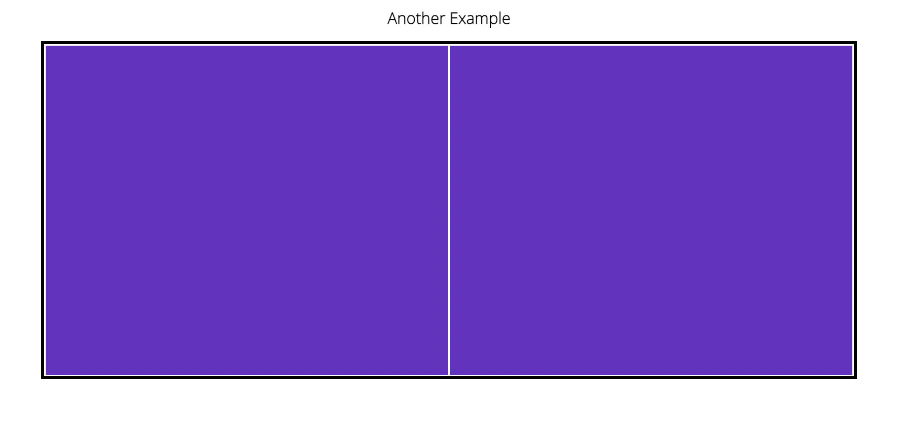
Flex Shorthand
- Three value
flex: flex-grow | flex-shrink | flex-basis
main {
    width: 80%;
    margin: 0 auto;
    border: 5px solid black;
    height: 500px;
    display: flex;
}
main .sidebar {
    background-color: #6930c3;
    border: 2px solid white;
    flex:1;
}
main .maincontent {
    background-color: #80ffdb;
    /* flex: 2 1 800px; */
}
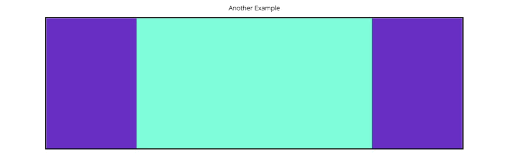
main {
    width: 80%;
    margin: 0 auto;
    border: 5px solid black;
    height: 500px;
    display: flex;
}
main .sidebar {
    background-color: #6930c3;
    flex: 1 300px;
}
main .maincontent {
    background-color: #80ffdb;
    flex: 2 800px;
}
Responsive Design & Media Queries
- Responsive design
Early on, it was common to create seperate stylesheets for different devices, or even completely different websites for each size.
These days, we typically create ONE website and stylesheet that is able to respond to different device sizes and features. - Media queries
Allow us to modify our styles depending on particular parameters like screen width or device type.
@media (min-width: 600px) and (max-width: 800px){
    h1 {
        color: purple;
    }
}
@media (orientation: landscape) {
    body {
        background-color: cyan;
    }
}
Building a Responsive Nav
nav {
    font-size: 1.5em;
    display: flex;
    justify-content: space-between;
}

ul {
    border: 1px solid red;
    flex: 1;
    max-width: 50%;
    display: flex;
    justify-content: space-evenly;
}

ul,li {
    display: inline;
    margin: 0;
    padding: 0;
}

@media (max-width: 768px) {
    h1 {
        font-size: 4em;
    }
    nav, nav ul {
        flex-direction: column;
    }
}

@media (max-width: 576px) {
    h1 {
        font-size: 3em;
    }
}
뭐,, 이런 방법이 있어요
근데 왜인지 ul {justify-content: space-evenly;}가 먹히질 않아서 캡쳐는 안했음.. 똑같이 따라 적었는데 왜 안될까나....
개발을 배우는 듯 하면서도