HTML/CSS/JS로 만드는 스타벅스 웹사이트
CSS 속성
배치
position
요소의 위치 지정 기준
- static
기준 없음 - relative
요소 자신을 기준
원래 자신이 있던 자리를 기준으로
실제 요소가 움직였다는 것이라기 보단 허상의 요소로 보여진다.
배치 용도로 사용하는 경우는 적다. - absolute
위치 상 부모 요소를 기준
위치가 공중으로 뜨면서 주변 형제들과의 상호작용이 무너진다.
부모, 상위 요소에 position 값이 있어야 한다. (최상위는 뷰포트) - fixed
뷰포트(브라우저)를 기준
부모, 상위 요소에 position 값을 다 무시하고 뷰포트를 기준으로 배치된다.
position 선언 후 top, bottom, right, left, z-index 값을 지정해 위치 지정한다.
요소 쌓임 순서(Stack order)
어떤 요소가 사용자와 더 가깝게 있는지(위에 쌓이는지) 결정
- 요소에 position 속성의 값이 있는 경우 위에 쌓임. (기본값 static 제외)
- 1번과 조건이 같은 경우, z-index 속성의 숫자 값이 높을 수록 위에 쌓임.
- 1, 2번의 조건과 같은 경우, HTML의 다음 구조(나중에 작성)일 수록 위에 쌓임.
.container {
width: 300px;
background-color: orange;
position: relative;
}
.container .box {
width: 100px;
height: 100px;
border: 4px dashed black;
background-color: green;
margin-bottom: 5px;
}
.container .box:nth-child(1) {
}
.container .box:nth-child(2) {
position: absolute;
top: 50px;
left: 80px;
}
.container .box:nth-child(3) {
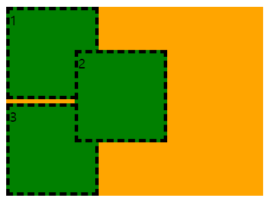
}2번 box가 1번 조건에 부합하기 때문에 가장 위쪽에 쌓여있다.
1번 box에 position 값이 들어가도 3번 조건에 의해 가장 위쪽에 쌓이게 된다.
3번 box에 position 값이 들어가면?
.container {
width: 300px;
background-color: orange;
position: relative;
}
.container .box {
width: 100px;
height: 100px;
border: 4px dashed black;
background-color: green;
margin-bottom: 5px;
}
.container .box:nth-child(1) {
position: relative;
}
.container .box:nth-child(2) {
position: absolute;
top: 50px;
left: 80px;
}
.container .box:nth-child(3) {
/* 이 부분 추가!*/
position: relative;
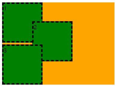
}3번 box가 HTML 구조에서 가장 나중에 작성 되었기 때문에 가장 위쪽에 쌓인다.
2번 box에 z-index 값을 넣어주면?
.container {
  width: 300px;
  background-color: orange;
  position: relative;
}

.container .box {
  width: 100px;
  height: 100px;
  border: 4px dashed black;
  background-color: green;
  margin-bottom: 5px;
}

.container .box:nth-child(1) {
  position: relative;
}
.container .box:nth-child(2) {
  position: absolute;
  top: 50px;
  left: 80px;
  /* 이 부분 추가! */
  z-index: 1;
}
.container .box:nth-child(3) {
    position: relative;
}
1번 조건은 모두 같고, 2번 조건에 의해 z-index 값을 가진 2번 box가 가장 위에 쌓여 첫번째 사진과 결과가 같다.
z-index?
요소의 쌓임 정도를 지정 (두번째 조건)
숫자가 높을 수록 위에 쌓인다.
position 값에 따라 요소 변경
position 값으로 absolute, fixed가 지정된 요소는 display가 block으로 변경된다.
Flex(정렬)
부모 요소에 diplay: flex; 를 추가하여 1차원의 레이아웃 배치가 가능하게 한다.
Flex container
display: flex; 속성이 부여된 부모 요소
- display
flex container의 화면 출력(보여짐) 특성- flex
블록 요소와 같이 정의 - inline-flex
인라인 요소와 같이 정의
- flex
- flex-direction
주 축(수평/수직)을 설정- row
기본 값. 행(수평) 축 (시작: 좌->우) - row-reverse
행(수평) 축 (시작: 우->좌) - column
열(수직) 축 (시작: 위->아래) - column-reverse
열(수직) 축 (시작: 아래->위)
- row
- flex-wrap
flex items 묶음(줄 바꿈) 여부- no wrap
기본 값. 줄 바꿈 없음 - wrap
flex items 줄 바꿈 하기
- no wrap
- justify-content
주 축(x축)의 정렬 방법. 수평 정렬- flex-start
기본 값. flex items를 시작점으로 정렬 - flex-end
flex items를 끝점으로 정렬 - center
flex items를 가운데 정렬
- flex-start
- align-content
교차 축(y축)의 여러 줄 정렬 방법. 수직 정렬
items들이 여러 줄이어야지만 적용될 수 있다.- stretch
- flex-start
- flex-end
- center
- align-items
교차 축(y축)의 한 줄 정렬 방법. 수직 정렬- stretch
- flex-start
- flex-end
- center
Flex items
-
order
flex items의 순서
기본 값은 0, 숫자가 작을수록 먼저 정렬 (음수 가능) -
flex-grow
flex items의 증가 너비 비율
기본 값은 0 -
flex-shrink
flex items의 감소 너비 비율
기본 값은 1. flex container의 너비가 작을 때 flex items들이 줄어드는 비율
flex-shrink의 값이 0이면 flex container의 너비가 작아도 자신들의 너비를 유지하며 존재한다. -
flex-basis
flex items의 공간 배분 전 기본 너비
기본 값은 content의 너비(auto)
flex-basis의 값이 0이면 content의 너비는 무시하고 요소 박스의 너비 비율로 맞춰준다.