react 에서 html js 말고 우리의 눈을 즐겁게 해주는 녀석.... css
보통 이렇게 적곤한다.
하지만 이렇게말고 ,
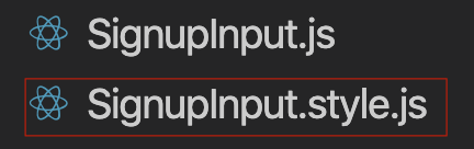
SignupInput.style.js처럼 이렇게 할수가 있다.
안에 있는 내용은 어떻게 되어있을까 ??
import styled from 'styled-components';

export const Container = styled.div`
  height: 100%;
  width: 100%;
`;

export const InputForm = styled.div`
  margin: 80px auto 20px;
  padding: 25px 0 40px;
  height: auto;
  width: 50vw;
  max-width: 550px;
  border-radius: 15px;
  background: #f2f3f7;
  h1 {
    text-align: center;
    margin-top: 0;
    margin-bottom: 30px;
  }
  .form-group {
    display: flex;
    align-items: center;
    justify-content: center;
    padding: 0 8vw;
  }
  input {
    flex: 1;
    height: 35px;
    margin-bottom: 5px;
    max-width: 400px;
    font-size: 1.2rem;
  }

  p {
    color: red;
    font-size: 1.2vw;
    margin-bottom: 5px;
  }

  input[type='number']::-webkit-inner-spin-button,
  input[type='number']::-webkit-outer-spin-button {
    -webkit-appearance: none;
    margin: 0;
  }

  input::placeholder {
    color: black;
    font-weight: 500;
  }

  input:focus::-moz-placeholder {
    color: transparent;
  }
  input:focus::-o-placeholder {
    color: transparent;
  }
  input:focus::-webkit-input-placeholder {
    color: transparent;
  }

  button {
    flex: 1;
    margin: 20px 0;
    height: 30px;
    background-color: gold;
    max-width: 400px;
    border-radius: 5px;
  }
  @media (max-width: 500px) {
    width: 80vw;
    p {
      font-size: 1.8vw;
    }
  }
`;

export const SocialForm = styled.div`
  display: flex;
  margin: 0 auto;
  padding-left: 15px;
  height: 80px;
  width: 250px;
  background: #f2f3f7;
  border-radius: 10px;
  align-items: center;
  cursor: pointer;
  div {
    display: flex;
    width: 50px;
    height: 50px;
    background-repeat: no-repeat;
    background-position: center;
    background-size: cover;
  }
  p {
    margin-left: 30px;
    font-size: 1.2rem;
  }
  :hover {
    color: white;
    background-color: black;
  }
`;
이렇게 되어있고 ,
import { Container, InputForm, SocialForm } from './SignupInput.style';간단하게 InputForm
  return (
    <Container>
      <InputForm>
        <h1>회원가입</h1>
<InputForm>
를 입력하면 style 이 먹히게 된다.
태스 스타일 custom
const ButtonCustom = styled.button`
  border-radius: 5px;
  background: coral;
  color: black;
`;
div 에 style 주는것처럼 똑같이 태그를 작성해서 custom 하면된다.
부모밑에 자식 스타일 넣기
html 이 이렇게 존재한다고 하면 ,
            <Header>
                <h1>상세 이미지</h1>
                <CloseBtn onClick={onClose}/>
            </Header>
Header 라는 태그 밑에 자식이
 <h1>상세 이미지</h1>
 <CloseBtn onClick={onClose}/>
이렇게 두개 존재한다.
우선적으로 스타일 h1 만 예시로 주게 되면 ,
export const Header = styled.header`
  height: 44px;
  background: white;
  position: relative;
  padding: 0;
  text-align: center;

  & h1 {
    margin: 0;
    font-size: 17px;
    color: #333;
    line-height: 44px;
  }
`;
& 를 붙이고 스타일을 붙이고 싶은 태그를 작성하면 된다
ex) & h1 { }

꾸준함이란 ... ?