float
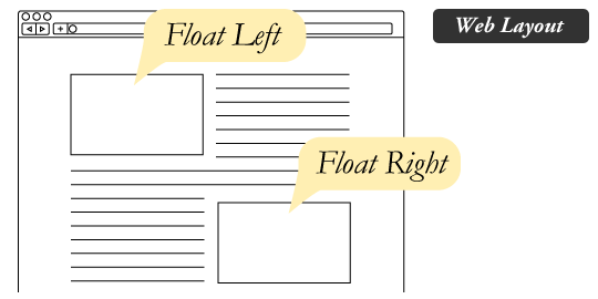
float 의 원래 목적은 이미지와 텍스트들을 어떻게 배치하기 위해 사용한다.
- float : left
이미지가 왼쪽에 배치된다. - float : right
이미지가 오른쪽에 배치된다. - float : center
이미지가 중앙에 배치된다.
예전에는 float 를 많이 많이 사용을 했었다. flexbox 가 있기전까지는...
왜 flexbox 인가 ??
flex box 는 무슨뜻이지 ??
flexible : 신축성 있는 , 탄력성있는 , 유연한
뜻이고 box 가 있으니깐
유연한 박스라는 뜻이다.
고정적이지 않고 , 유동적으로 사용해야할때 flexbox 를 사용하게된다.
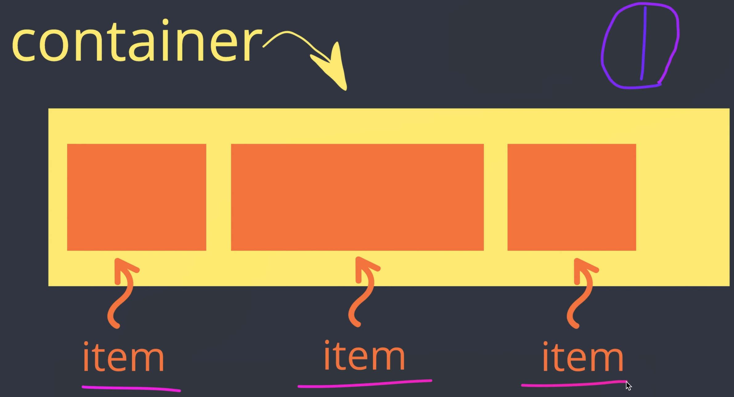
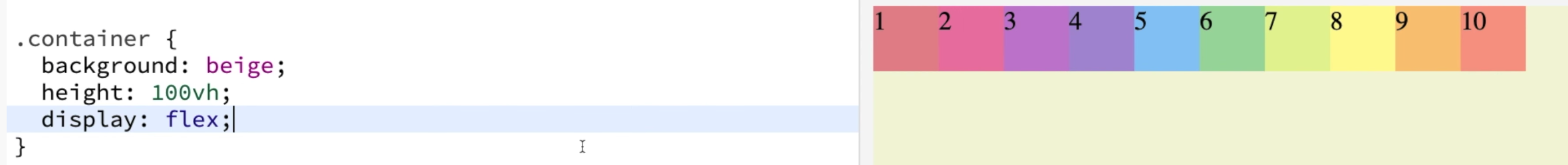
flexbox
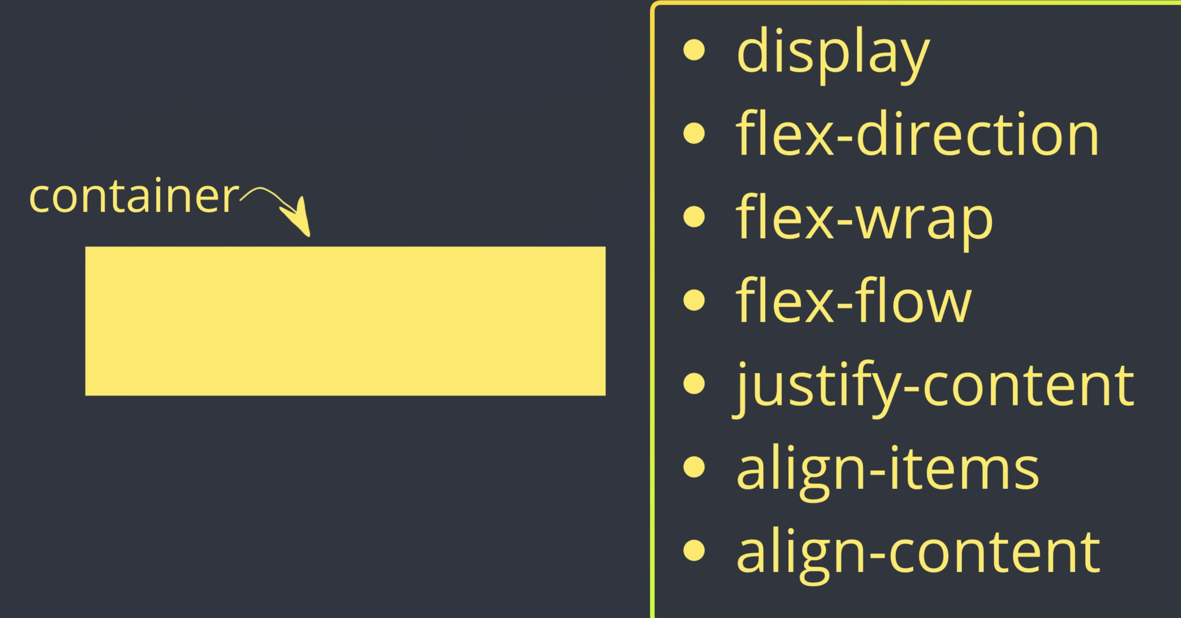
container
.container {
  background:beige;
  height:100vh;
  display : flex;
}
flex-direction
row
기본값은 row 이다.
row 는 왼쪽에서 오른쪽으로 가는 방향이다.
container {

background:beige;
height:100vh;
display : flex;

}
row-reverse
row-reverse 는 오른쪽에서 왼쪽이다.
container {

background:beige;
height:100vh;
display : flex;
flex-direction : row-reverse;

}
column
column 은 위에서 아래로이다.
container {

background : heige;
height : 100vh;
display : flex;
flex-direction : column;
column-reverse
column-reverse 는 아래에서 위로이다.
container {

background : heige;
height : 100vh;
display : flex;
flex-direction : column-reverse;

}
flex-wrap
기본값은 nowrap 이다.
내가 기본을 설정안하게 되면 , 웹 브라우저 크기가 줄어들어도 ,아이템들이 한줄에서 크기만 변하게 된다.
flex-wrap:
container {

background : beige;
height: 100vh;
display : flex;
flex-direction : row;
flex-wrap : wrap;

}
flex-wrap : wrap 을 설정하게 되면 , 웹 브라우저 크기가 줄어들었을 경우 줄바꿈을 하게 된다.
flex-wrap: wrap-reverse 을 설정하면 웹브라우저 크기가 줄어들었을 경우
container > items
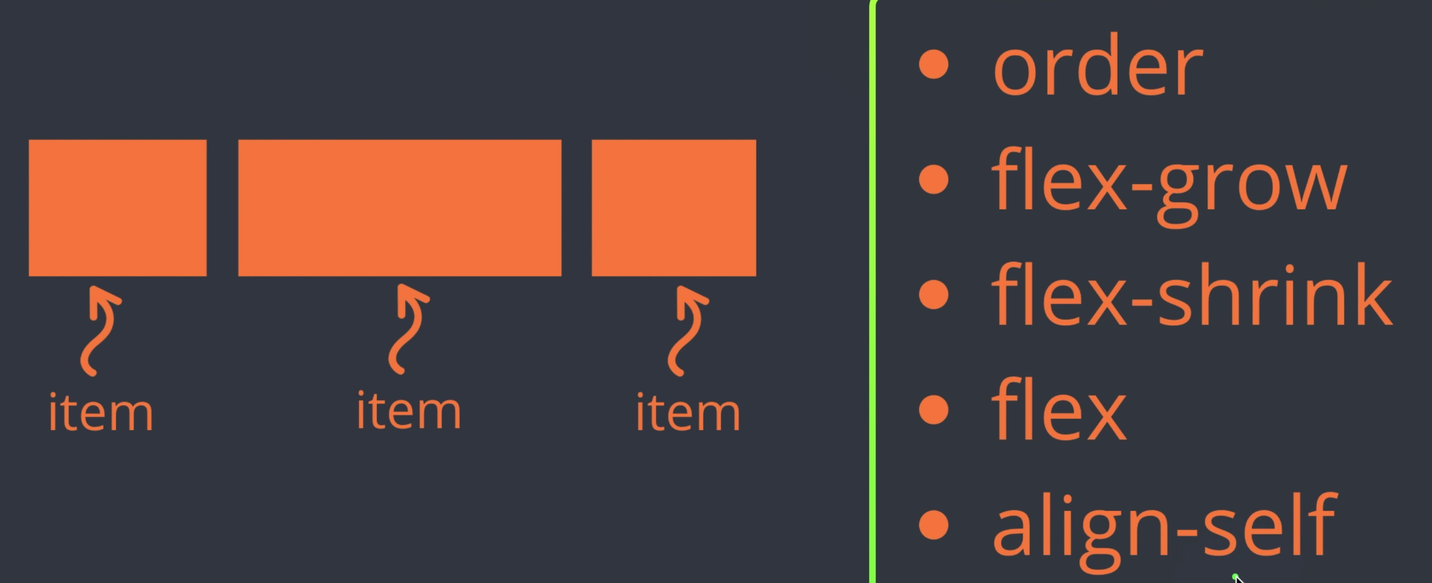
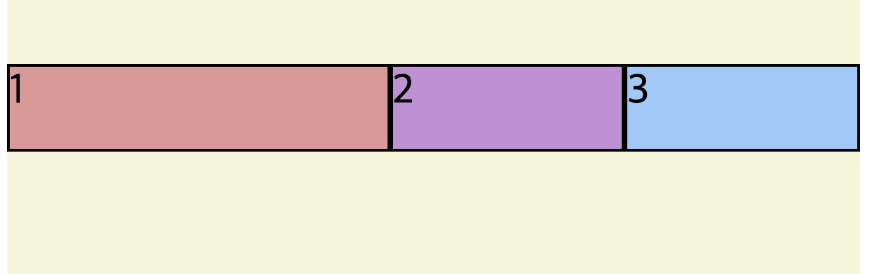
flex-grow
기본값은 0 이다.
그러나 값을 주게 되면 그 값에 맞게 공간을 채우게 된다.
<!DOCTYPE html>
<html>
  <head>
    <meta charset="UTF-8" />
    <title>Parcel Sandbox</title>
  </head>
  <style>
    .container {
      padding-top: 100px;
      background: beige;
      height: 100vh;
      display: flex;
    }
    .item {
      width: 40px;
      height: 40px;
      border: 1px solid black;
    }
    .item1 {
      background: #ef9a9a;
      flex-grow: 2;
    }
    .item2 {
      background: #ce93d8;
      flex-grow: 1;
    }
    .item3 {
      background: #90caf9;
      flex-grow: 1;
    }
  </style>
  <body>
    <div class="container">
      <div class="item item1">1</div>
      <div class="item item2">2</div>
      <div class="item item3">3</div>
    </div>
  </body>
</html>
flex-shrink
flex-shrink 는 container가 줄어들때 , 얼마너 어떻게 더 늘고 줄어드는지 조정 할 수 있다.
<!DOCTYPE html>
<html>
  <head>
    <meta charset="UTF-8" />
    <title>Parcel Sandbox</title>
  </head>
  <style>
    .container {
      padding-top: 100px;
      background: beige;
      height: 100vh;
      display: flex;
    }
    .item {
      width: 40px;
      height: 40px;
      border: 1px solid black;
    }
    .item1 {
      background: #ef9a9a;
      flex-grow: 2;
      flex-shrink: 2;
    }
    .item2 {
      background: #ce93d8;
      flex-grow: 1;
      flex-shrink: 1;
    }
    .item3 {
      background: #90caf9;
      flex-grow: 1;
      flex-shrink: 1;
    }
  </style>
  <body>
    <div class="container">
      <div class="item item1">1</div>
      <div class="item item2">2</div>
      <div class="item item3">3</div>
    </div>
  </body>
</html>
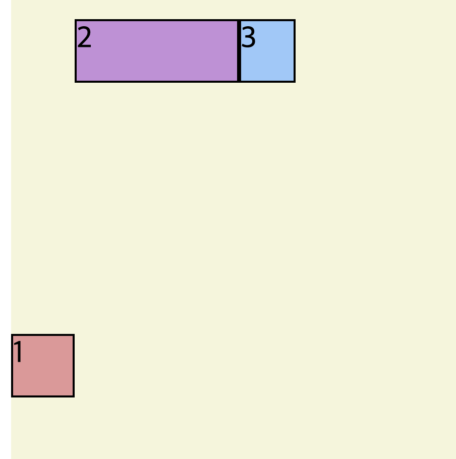
flex-basis
flex-basis 는 상대적으로 다른 아이템에 비해서 몇퍼센트를 차지하는지 지정할 수가 있다 .
<!DOCTYPE html>
<html>
  <head>
    <meta charset="UTF-8" />
    <title>Parcel Sandbox</title>
  </head>
  <style>
    .container {
      padding-top: 100px;
      background: beige;
      height: 100vh;
      display: flex;
    }
    .item {
      width: 40px;
      height: 40px;
      border: 1px solid black;
    }
    .item1 {
      background: #ef9a9a;
      flex-basis: 60%;
    }
    .item2 {
      background: #ce93d8;
      flex-basis: 30%;
    }
    .item3 {
      background: #90caf9;
      flex-basis: 10%;
    }
  </style>
  <body>
    <div class="container">
      <div class="item item1">1</div>
      <div class="item item2">2</div>
      <div class="item item3">3</div>
    </div>
  </body>
</html>
align-self
align-self 를 이용하게 되면 container 안에 있는 아이템 중에 하나를 골라내서 그것만 지정할 수 있게 된다.
<!DOCTYPE html>
<html>
  <head>
    <meta charset="UTF-8" />
    <title>Parcel Sandbox</title>
  </head>
  <style>
    .container {
      padding-top: 100px;
      background: beige;
      height: 100vh;
      display: flex;
    }
    .item {
      width: 40px;
      height: 40px;
      border: 1px solid black;
    }
    .item1 {
      background: #ef9a9a;
      align-self: center;
    }
    .item2 {
      background: #ce93d8;
      flex-basis: 30%;
    }
    .item3 {
      background: #90caf9;
      flex-basis: 10%;
    }
  </style>
  <body>
    <div class="container">
      <div class="item item1">1</div>
      <div class="item item2">2</div>
      <div class="item item3">3</div>
    </div>
  </body>
</html>