Flexbox
float와 비슷하게block요소들을 가로, 세로배치하기 위해 사용
CSS flexbox 속성은 인터페이스 내의 아이템 간 공간 배분과 강력한 정렬 기능을 제공하기 위한 1차원 레이아웃 모델 로 설계되었다.
flexbox는 레이아웃을 다룰 때 한 번에 하나의 차원(행이나 열)만을 다룬다.

Flexbox 사용 순서
flexbox 사용 선언
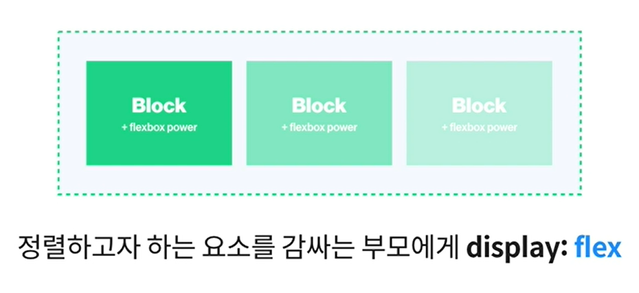
flexbox를 사용하고자 하는 요소 부모의 display속성값을 flex로 선언한다.
/* flexbox를 사용하고자 하는 요소의 부모에 적용 */

.parent {
  /* flex | inline-flex */
  display: flex;
}

.child {

}
정렬 방향 설정
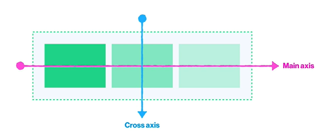
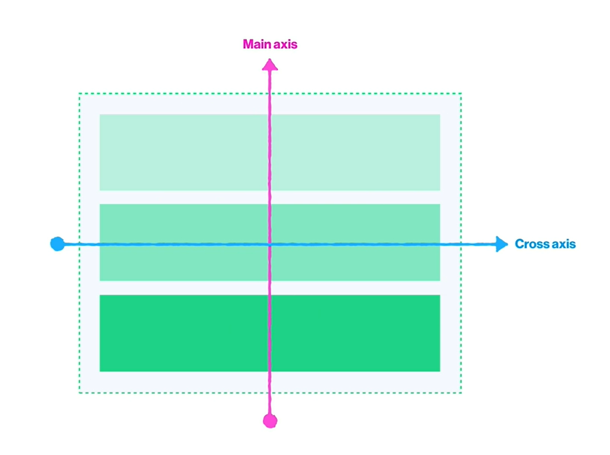
flexbox는 flex-direction의 속성을 사용해 정렬 방향을 지정한다.
이 때 사용될 수 있는 속성값으로는 row, row-reverse, column, column-reverse등이 있다.
각각의 속성값에 따라 Main axis, Cross axis라는 기준선이 생긴다.
.parent {
  display: flex;
  /* row : 가로
  row-reverse : 반대 가로
  column : 세로
  column-reverse : 반대 세로 */
  flex-direction: row;
}
flex-direction: row
flex-direction: row-reverse

flex-direction: column

flex-direction : column-reverse
정렬 줄 수 설정
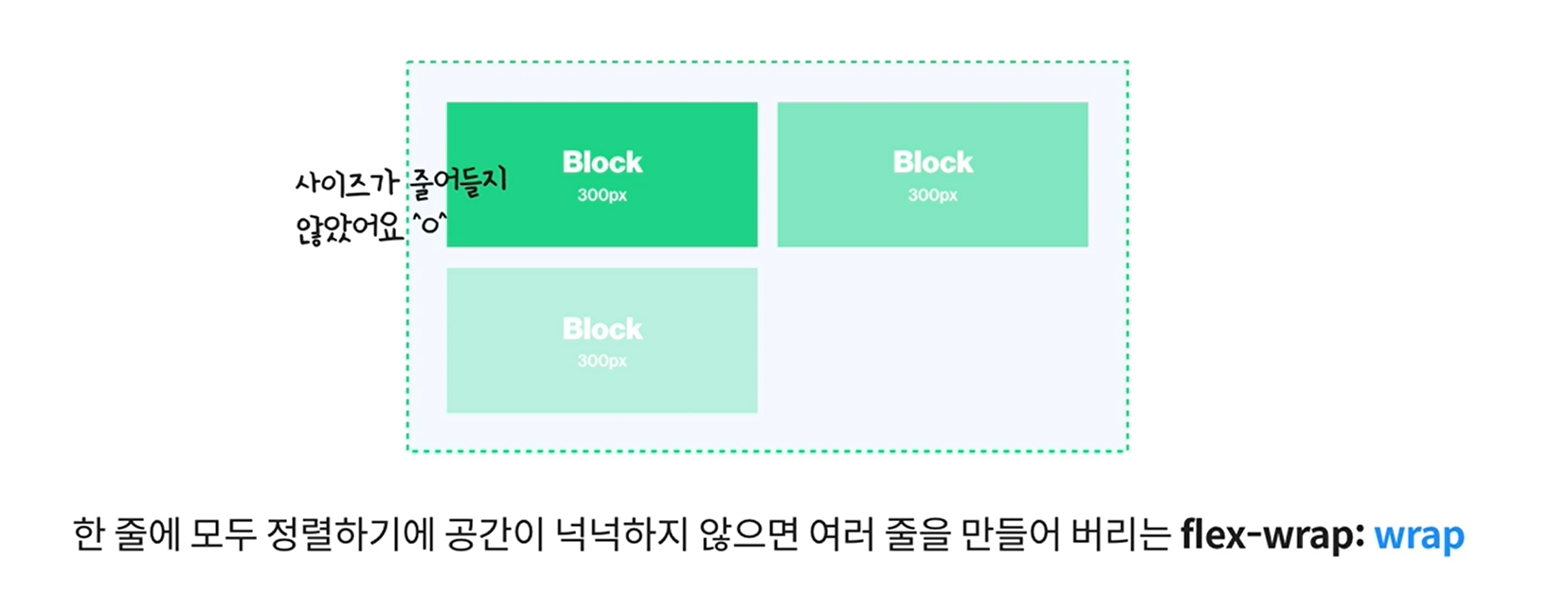
flexbox는 flex-wrap의 속성을 사용해 요소들의 크기를 가변적, 고정적으로 조정한다.
이 때 사용될 수 있는 속성값으로는 wrap, nowrap이 있다.
.parent {
  display: flex;
  flex-direction: row;
  /* nowrap : 한줄안에 모든요소 배치(가변적)
  wrap : 여러줄안에 모든요소 배치(고정적) */
  flex-wrap: nowrap;
}

flexbox설정 이 후 정렬속성
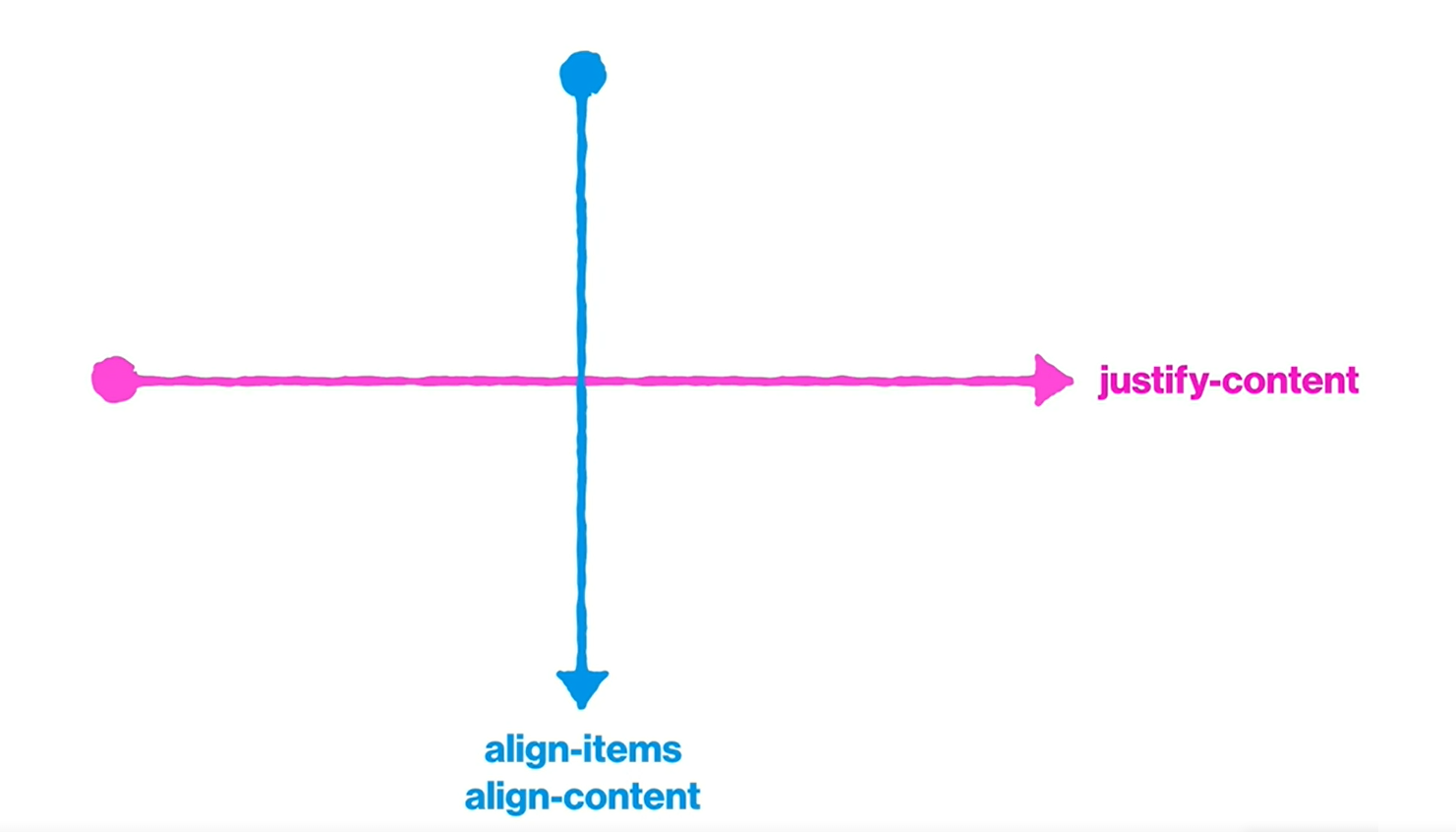
flexbox를 설정한 뒤 Main axis, Cross axis방향의 정렬을 지정한다.
이 때 Main axis방향으로 정렬을 지정하려면 justify-content속성을 사용하고, Cross axis방향으로 정렬을 지정하려면 align-items, align-content속성을 사용한다.
정렬속성에 사용되는 대표적인 속성값으로는 center, flex-start, flex-end, space-between, space-around등이 있다.
center
정렬속성에 사용되는 속성값 center는 요소를 가운데 정렬할 때 사용된다.
.parent {
  display: flex;
  flex-direction: row;
  flex-wrap: nowrap;
  /* 요소를 가운데 정렬 */
  justify-content: center;
}
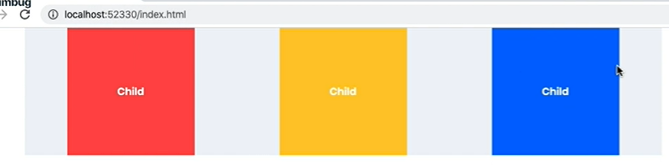
flex-start, flex-end
정렬속성에 사용되는 속성값 flex-start, flex-end는 main axis방향의 시작, 끝 정렬할 때 사용된다.
.parent {
  display: flex;
  flex-direction: row;
  flex-wrap: nowrap;
  /* 요소를 가운데 정렬 */
  justify-content: flex-start, end;
}
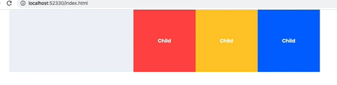
space-between
정렬속성에 사용되는 속성값 space-between은 요소들 사이 공백을 동일하게 정렬할 때 사용된다.
.parent {
  display: flex;
  flex-direction: row;
  flex-wrap: nowrap;
  /* 요소들 사이 공백 동일한 크기로 정렬 */
  justify-content: space-between;
}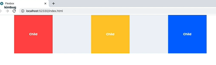
space-around
정렬속성에 사용되는 속성값 space-around는 각 요소들 좌우 공백을 동일하게 정렬할 때 사용된다.
.parent {
  display: flex;
  flex-direction: row;
  flex-wrap: nowrap;
  /* 각 요소들 좌우공백 동일한 크기로 정렬 */
  justify-content: space-around;
}
참고 자료
Flexbox - CSS: Cascading Style Sheets | MDN
김버그의 CSS는 재밌다 - 기초부터 실무 레벨까지