
CSS
Paddings and IDs
padding은 margin과 반대개념
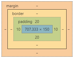
margin : box의 경계로부터 '바깥'에 있는 공간
padding : box의 경계로부터 '안쪽'에 있는 공간
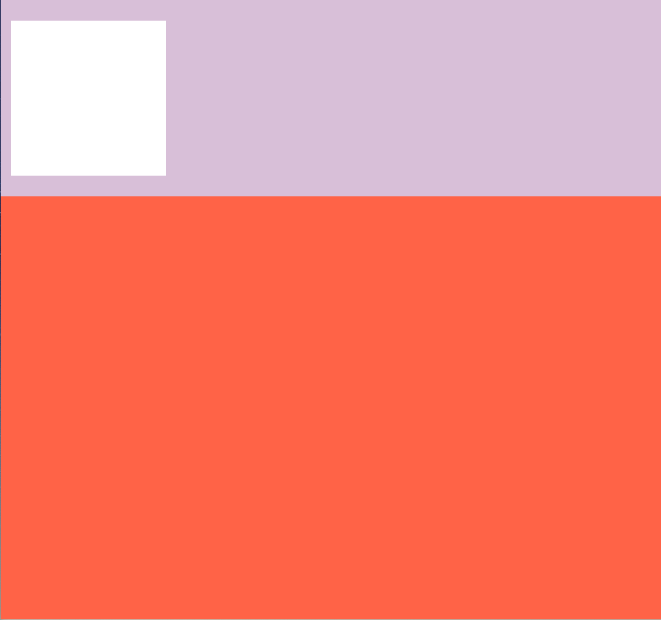
<!-- body에 padding추가 -->

<style>
      html {
        background-color: tomato;
      }
      body {
        margin: 0;
        padding: 20px 10px;
        background-color: thistle;
      }
      div {
        height: 150px;
        width: 150px;
        background-color: white;
      }
    </style>
결과
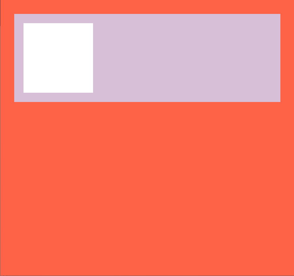
<!--body에 margin, padding 둘 다 추가 -->

body {
        margin: 30px;
        padding: 20px;
        background-color: thistle;
      }
결과
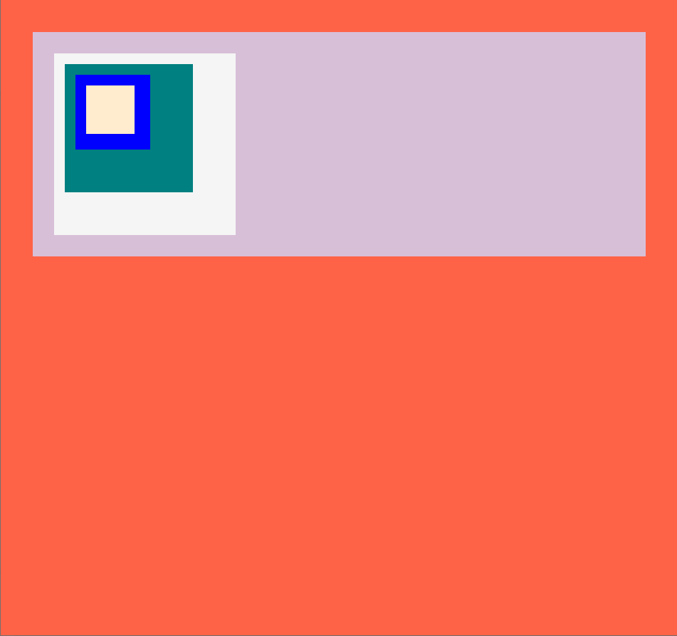
id를 가리키고싶다면 #id명
<head>

    <style>
      html {
        background-color: tomato;
      }
      body {
        margin: 30px;
        padding: 20px;
        background-color: thistle;
      }
      div {
        height: 150px;
        width: 150px;
        background-color: whitesmoke;
        padding: 10px;
      }
      #first {
        background-color: whitesmoke;
      }
      #second {
        background-color: teal;
      }
      #third {
        background-color: blue;
      }
      #fourth {
        background-color: blanchedalmond;
      }
    </style>
  </head>

  <body>
    <div id="first">
      <div id="second">
        <div id="third">
          <div id="fourth"></div>
        </div>
      </div>
    </div>
  </body>
결과
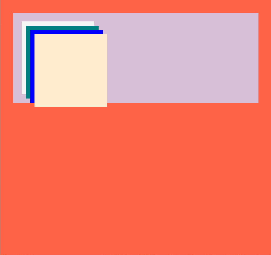
❓여기서 의문!
상하좌우에 10px만큼 div에 padding을 공통적으로 넣어주면 똑같은 padding값을 준거니까 크기가 같아 하나의 네모로만 보여야하는거 아닌가? 왜 저렇게 결과가 나올까?
=> div안에 div를 넣고 패딩을 줬으니까!
padding된 내용에 paading된 내용을 더 넣고 겹겹이 쌓다 보면 중첩 돼서 점점 더 아래로 쌓이는 형식이 된다!
❔ 꼬리의문!
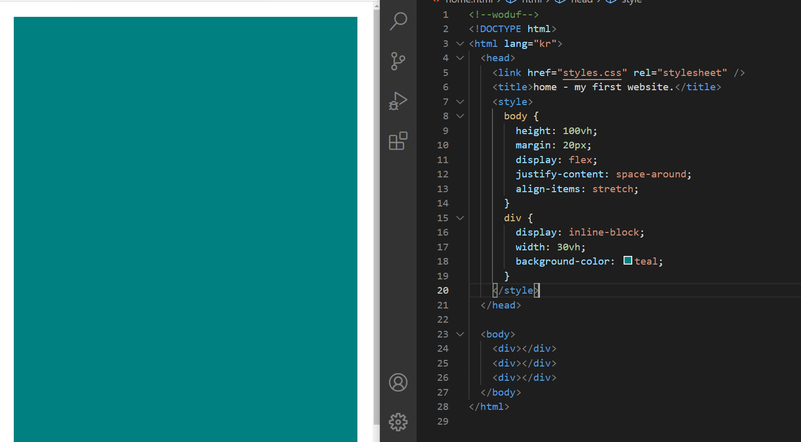
그럼 div안에div를 넣는게 아닌,
body안에 div를 나열하는 방법으로 하면??
=> 그럼 box가 중첩X, 저번시간에 block box 배운것처럼 걍 세로로 네모가 나열됨!
<!--div에 설정된 크기값 제거, 각 id에 따로 크기값 추가-->

      div {
        background-color: white;
        padding: 10px;
      }
      #first {
        background-color: whitesmoke;
        width: 150px;
        height: 150px;
      }
      #second {
        background-color: teal;
        width: 100px;
        height: 100px;
      }
      #third {
        background-color: blue;
        width: 50px;
        height: 50px;
      }
      #fourth {
        background-color: blanchedalmond;
        width: 25px;
        height: 25px;
      }
결과
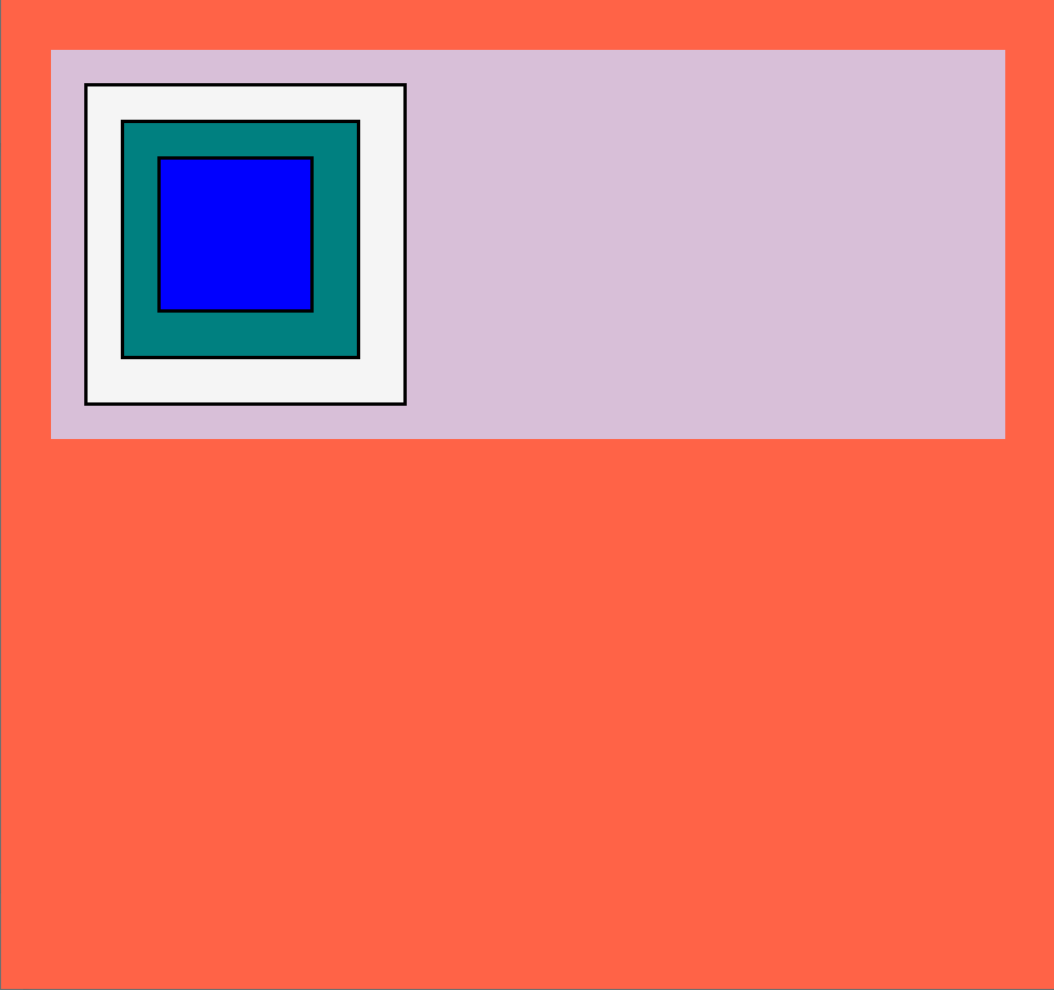
border
border : box의 경계
<!--위 코드에서 fourth 지워주고 div에 border효과 추가-->

div {
        padding: 20px;
        border: 2px solid black;
      }
결과
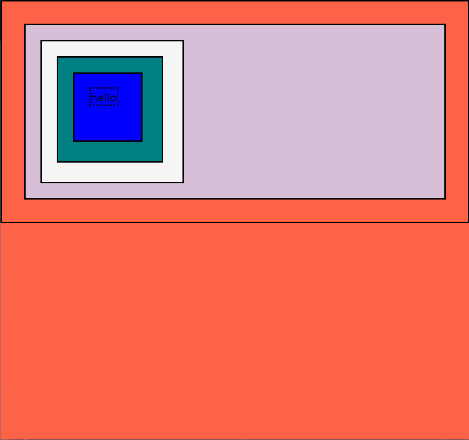
* 는 전체를 뜻해
<!--모든 요소에 2px의 검은색 실선으로 된 border를 만들 수 있음-->

      * {
        border: 2px solid black;
      }
결과

정리
우리는 style 속성을 이용해서 border가 어떻게 보일지를 정할 수 있어
<!-- 위 코드에서 div third안에 문구 추가, 그 문구만 border효과 바꾸고싶어-->

    <style>
      span {
        border-style: dotted;
      }
    </style>
  </head>

  <body>
    <div id="first">
      <div id="second">
        <div id="third">
          <span>hello</span>
        </div>
      </div>
    </div>
  </body>
결과
Classes
  <head>
    <style>
      body {
      	background-color: wheat;
        margin: 20px;
      }
      span {
        background-color: teal;
      }
    </style>
  </head>

  <body>
    <span>hello</span>
  </body>
결과

이제 padding이 span에 적용되는지 보자
<!--span에 padding, margin 추가 span문구 더 추가-->
		.
		.
		.

      span {
        background-color: teal;
        padding: 20px;
        margin: 30px;
      }
    </style>
  </head>

  <body>
    <span>hello</span>
    <span>hello</span>
  </body>
결과
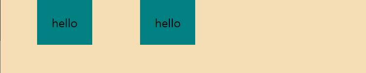
span에 margin이 위,아래에도 30px씩이라 되어 있는데 실제로는 좌, 우에만 적용됐어
=> inline이기 때문
inline : 높이와 너비가 없음 그래서 위,아래에 margin을 가질 수 X
padding : 사방에 다 가질 수 있음
=> 위,아래에 margin주고 싶으면 저번시간에 배운 inline->block 변환 사용
이렇게 하고 싶을 때

안좋은 코드
<head>
  <style>
      #tomato {
        background-color: tomato;
      }
      #tomato2 {
        background-color: tomato;
      }
      #tomato3 {
        background-color: tomato;
      }
    </style>
 </head>

 <body>
    <span>hello</span>
    <span id="tomato">hello</span>
    <span>hello</span>
    <span id="tomato2">hello</span>
    <span>hello</span>
    <span id="tomato3">hello</span>
    <span>hello</span>
    <span>hello</span>
 </body>
좋은코드
.은 class명이라는 뜻
<head>
  <style>
      .tomato {
        background-color: tomato;
      }
    </style>
  </head>

  <body>
    <span>hello</span>
    <span class="tomato">hello</span>
    <span>hello</span>
    <span class="tomato">hello</span>
    <span>hello</span>
    <span class="tomato">hello</span>
    <span>hello</span>
    <span>hello</span>
  </body>
#tomato 는 id="tomato"
.tomato 는 class="tomato"
class명은 유일할 필요가 X
여러 요소들이 같이 쓸 수 있음
한 번에 여러 class가 쓰일 수 있음
id는 한번에 여러 개를 가질 수 없어
한 요소는 하나의 id만 가질 수 있음
네모 테두리를 둥글게 하는방법
border-radius: 5px;
이렇게 하고싶을 때
안좋은 코드
<head>
<style>
.teal {
background-color: teal;
padding: 5px 10px;
border-radius: 5px;
}
.tomato {
background-color: tomato;
color: white;
padding: 5px 10px;
border-radius: 5px;
}
</style>
</head>
<body>
<span class="teal">hello</span>
<span class="tomato">hello</span>
<span class="teal">hello</span>
<span class="tomato">hello</span>
<span class="teal">hello</span>
<span class="tomato">hello</span>
<span class="teal">hello</span>
<span class="teal">hello</span>
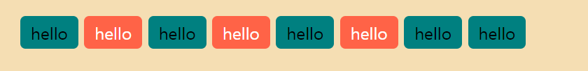
</body>좋은코드
<head>
  <style>
      .btn {
        padding: 5px 10px;
        border-radius: 5px;
      }
      .teal {
        background-color: teal;
      }
      .tomato {
        background-color: tomato;
        color: white;
      }
    </style>
  </head>

  <body>
    <span class="btn teal">hello</span>
    <span class="btn tomato">hello</span>
    <span class="btn teal">hello</span>
    <span class="btn tomato">hello</span>
    <span class="btn teal">hello</span>
    <span class="btn tomato">hello</span>
    <span class="btn teal">hello</span>
    <span class="btn teal">hello</span>
  </body>
id는 제약이 많아 class를 많이 쓴다.
Inline Block
<head>
    <style>
      div {
        display: inline;
        width: 50px;
        height: 50px;
      	background-color: teatl;
      }

    </style>
  </head>

  <body>
    <div></div>
    <div></div>
    <div></div>
  </body>
이렇게하면 결과가 아무것도 안나옴 빈 하얀 화면임.
왜냐면 inline은 너비랑 높이를 가질 수 없거든
display: inline-block;으로 바꿔주면
결과

근데 inline-block은 별로야
왜냐면 굉장히 많은 문제가 있지만 제일 큰 문제는 inline-block은 반응형 디자인을 지원하지 않아!!
Flexbox Part One
그래서 사람들이 생각해낸게 flexbox
flexbox는 박스들을 어떤 곳이든 둘 수 있어서 좋아 + 아주 유연함
2차원 레이아웃에서 아주 잘 작동해
flexbox 사용규칙
- 자식 엘리먼트에는 어떤 것도 적지 말아야 된다. 부모 엘리먼트에만 명시할것
- 주축 위에서 움직이는main axis(기본값=수평)과 교차축 위에서 움직이는 cross axis(기본값=수직)
justify-content: main axis적용
align_items: cross axis적용
나중엔 저 수평,수직인 기본 속성을 바꿀 수 있음
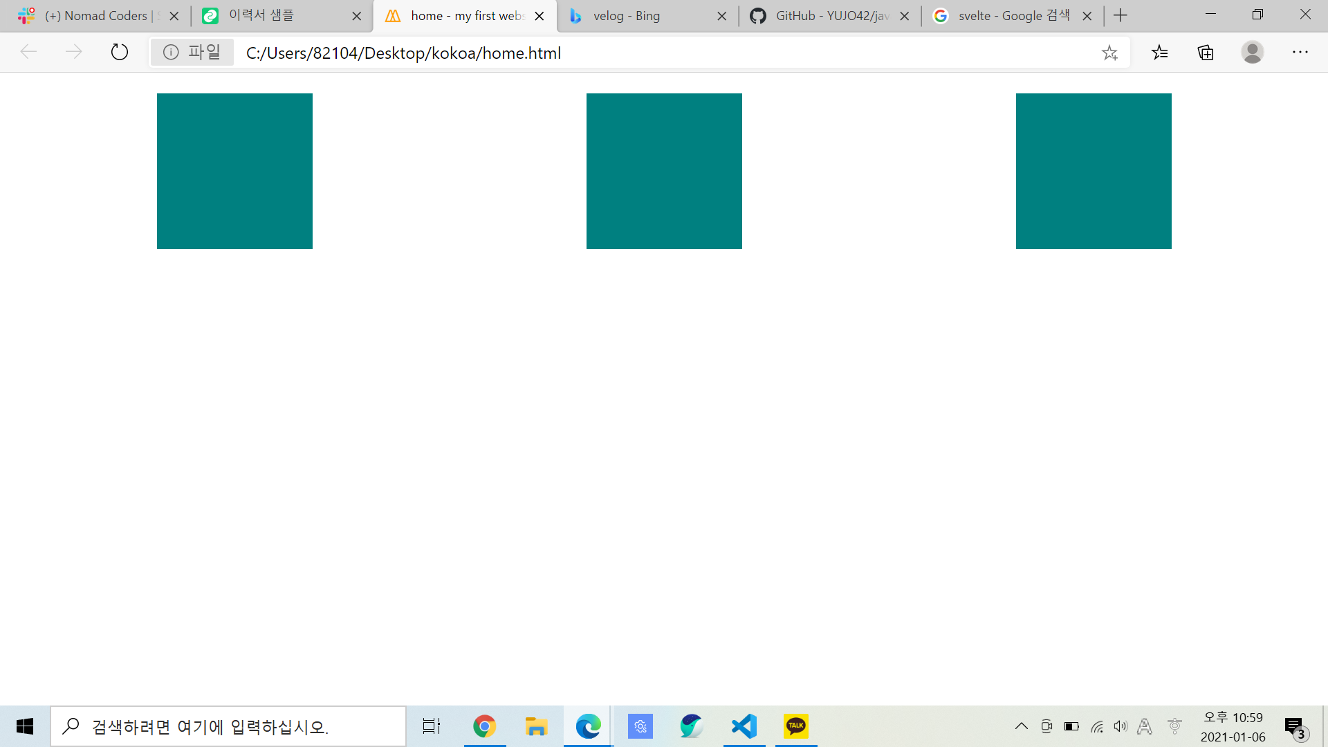
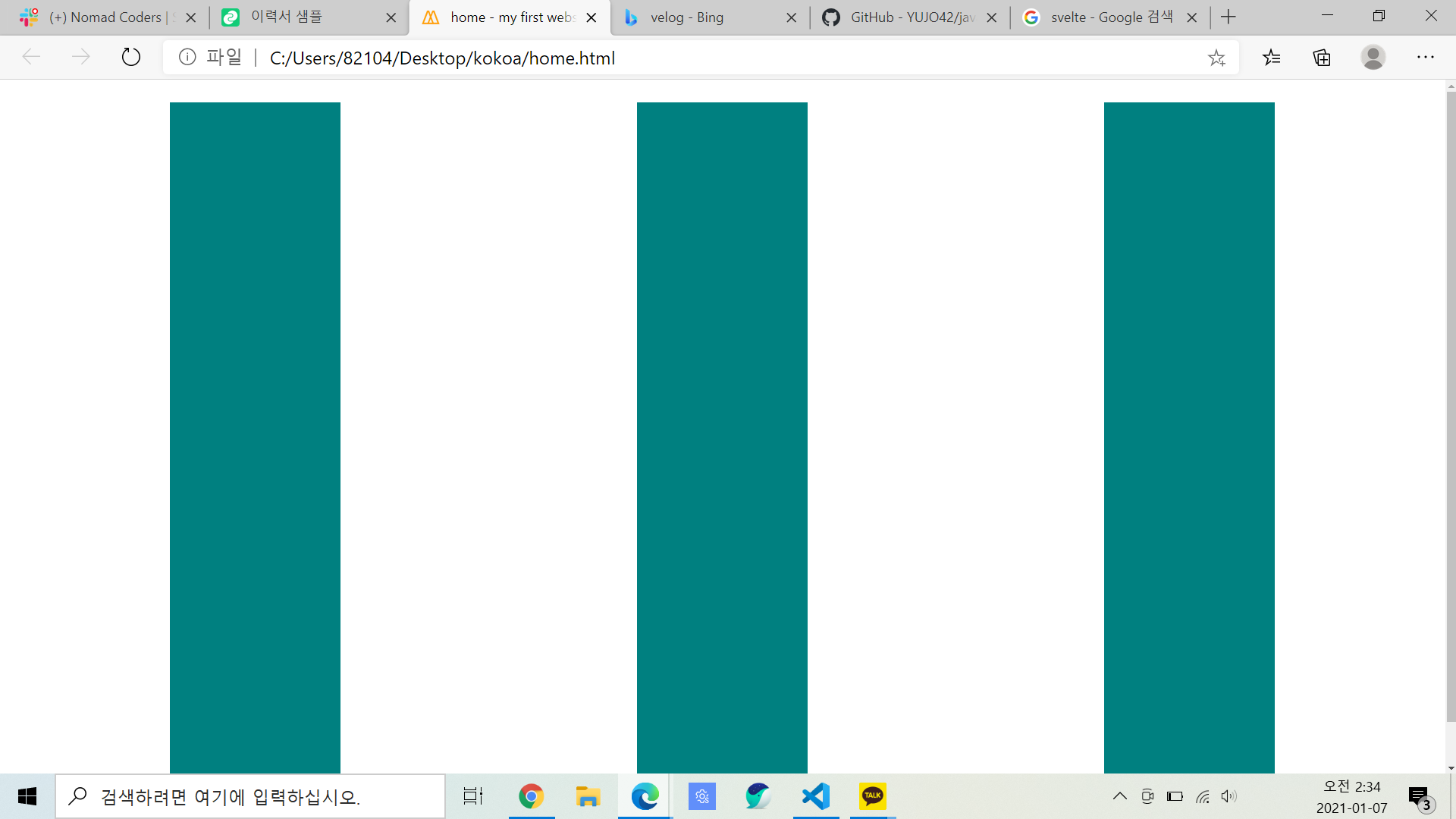
그럼 여기서 div의 부모 엘리먼트는 body이므로
<style> 속 <body> 에 display: flex; 입력
전체코드
<head>
   <style>
      body {
        margin: 20px;
        display: flex;
      }
      div {
        display: inline-block;
        width: 150px;
        height: 150px;
        background-color: teal;
      }
    </style>
  </head>

  <body>
    <div></div>
    <div></div>
    <div></div>
  </body>
결과

main axis
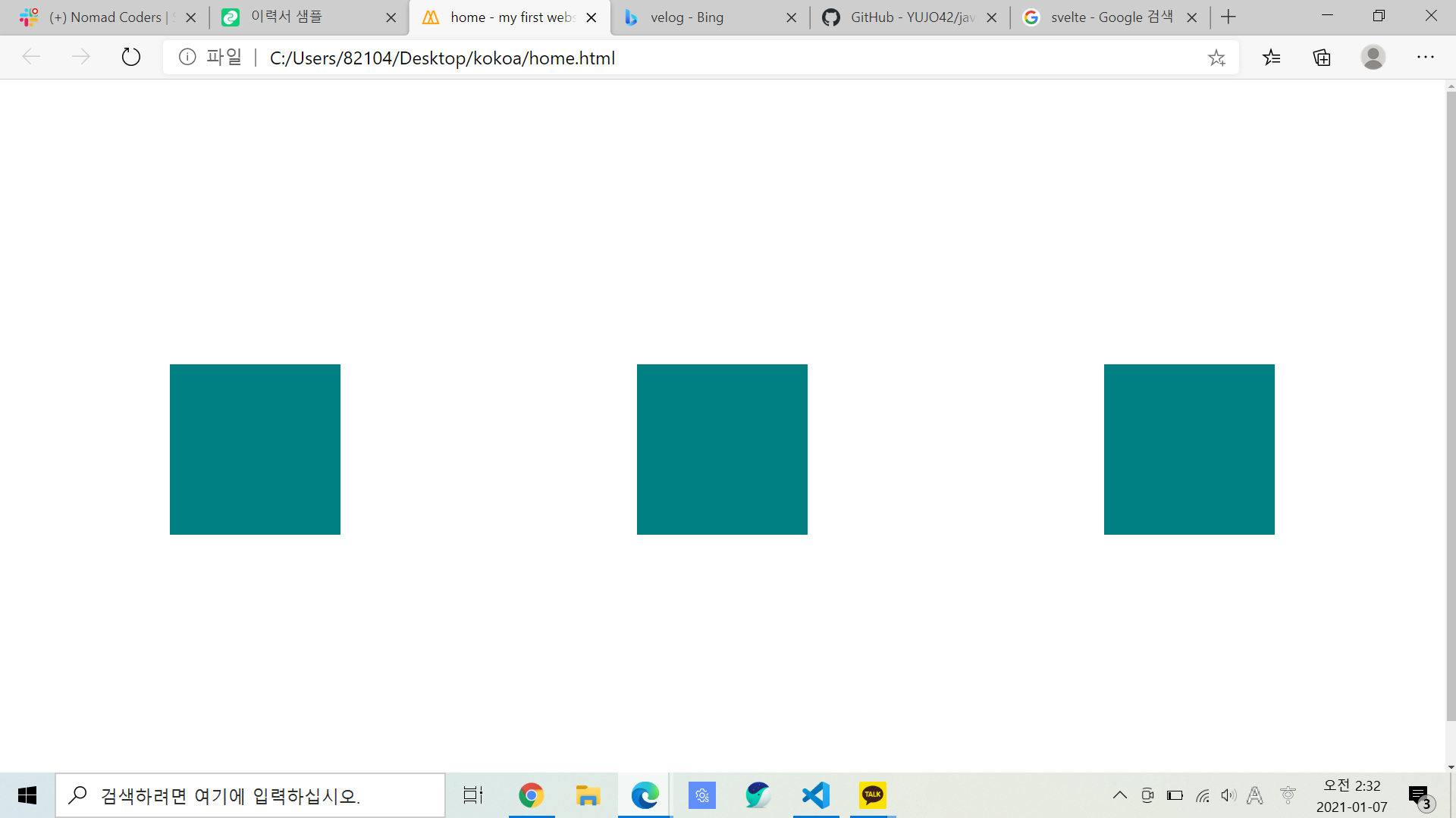
그럼 저 div box를 가운데정렬 하고싶다면?
위 코드 스타일body에 justify-content: center; 추가
<style>
      body {
        margin: 20px;
        display: flex;
        justify-content: center;
      }
</style>
결과
결론
가운데 정렬
justify-content: center;
오른쪽 정렬justify-content: flex-end;
왼쪽 정렬justify-content: flex-start;(얘가 기본값)
추가(+)
justify-content: space-evenly, space-around, space-between;: 빈 공간을 같은 크기로 나누어서 배치
순서대로 실행 모습
- evenly

- around
- between

나는 div에 아무짓도 하지 않았어.
<style>속 <body>에 명령어만 입력해준거야.
cross axis
그럼 저 box를 맨 위에 내열하지말구 중앙에 오도록 좀 내리자
style body에 align-items: center 에 입력
=> 하지만 이렇게하면 적용 안됨 왜?
이유: 지금 body에게 수직은 교차축에 있는 item들을 center로 하라고 말했는데
body는 박스 크기만함. 이미 수직으로 중심이여서 적용이 안된거야!
=> body에 height값을 줘야함
height값은 vh로 줘야함 ex)height: 100vh;
vh: viewport height를 말하는데 100vh=화면높이의 100%
가운데 정렬
align-items: center;
오른쪽 정렬align-items: flex-end;
왼쪽 정렬align-items: flex-start;(얘가 기본값)
div 늘리기align-items: stretch;: div의 height값을 없애줘야 이렇게 stretch가 적용됨
- center
- stretch
정리
- 더 쉽게 사용하기 위해 felxbox를 적용하고 싶다면 자식이 아니라 부모에게만 알려주면됨
- justify-content와 align-items를 적용하고 싶으면 먼저 display:flex를 해줘야함
- display: flex를 하면 해당 엘리먼트인 body가 flex컨테이너가 됨
- flex 컨테이너는 두 개의 축을 가지고 있다. 주축(justify-content)과 교차축(align-items)
★justify-content가 수평으로 적용된다고 하지 않았어 왜냐면 나중에 주축이 수직으로 적용되도록 바꿀 수도 있기 때문!★- style에서 body height값을 주지 않으면 align-items를 설정하더라도 바뀌지 않음 => 이미 맨 위아래를 차지하고 중심에 있으니까!
- 값은 px가 아닌 vh를 사용하는데 vh는 화면 크기에 따라 바뀜 아이폰, 맥, 그것보다 큰 화면에서 모두 달라
❓여기서 의문!
그럼 div width값을 px가 아닌 vh로 설정하면 가로도 화면 크기에 따라 바뀔까?
안됨^^
Flexbox Part Two
flex-direction 옵션 =column, row
display: flex =디폴트는 row
주축과 교차축 변경 방법
flex-direction: column; 코딩 추가
flex-direction이 column이면 주축은 수직이 되고 교차축은 수평이 돼
결과
align-items : 수직 -> 수평
justify-content : 수평 -> 수직
글자에도 사용 가능
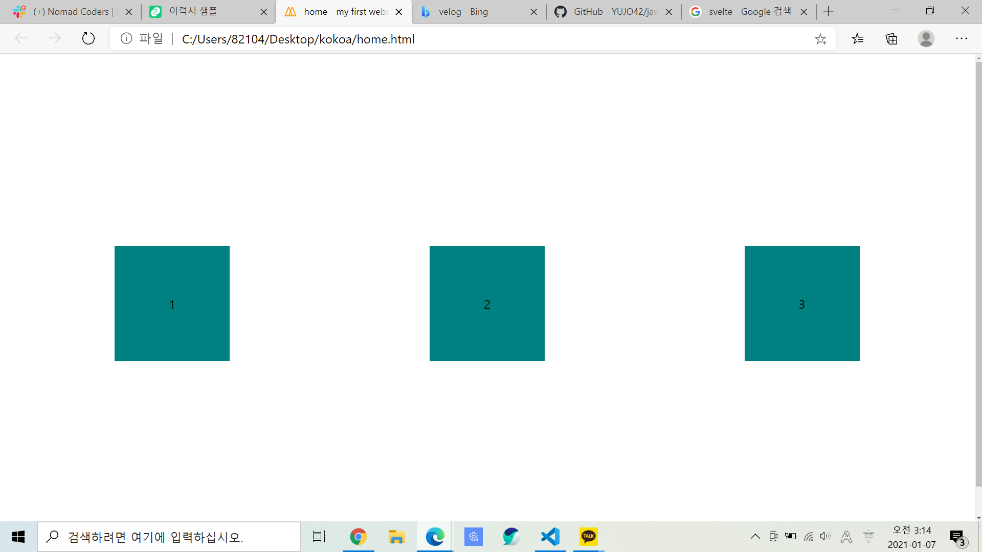
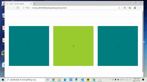
  <head>
    <style>
      body {
        height: 100vh;
        margin: 20px;
        display: flex;
        justify-content: space-around;
        align-items: center;
      }
      div {
        display: flex;
        justify-content: center;
        align-items: center;
        width: 150px;
        height: 150px;
        background-color: teal;
      }
    </style>
  </head>

  <body>
    <div>1</div>
    <div>2</div>
    <div>3</div>
  </body>
결과
flexbox속성
flex-wrap: nowrap; 모든 요소를 같은 줄에 있게 만들어줌. width를 초기 사이즈로만 여기고 화면 크기를 줄이면 모든 element를 같은 줄에 있게 하기 위해 width를 바꿀 수 있음
flex-wrap: wrap; 화면을 늘리든 좁히든 명시된 width,height 사이즈로 반영함
.gif)