Sign Up Screen part Three
우리가 원하든 원하지 않든 브라우저가 알아서 html에 margin을 적용시키는데
이걸 모두 없애는 방법이 있어 => 리셋 css
리셋 css : 대부분의 태그에 margin:0, padding:0, border:0 등을 가진 css파일
적용방법은 css파일에 리셋 css파일 추가
@import "리셋css파일이름.css";리셋 css 파일
html,
body,
div,
span,
applet,
object,
iframe,
h1,
h2,
h3,
h4,
h5,
h6,
p,
blockquote,
pre,
a,
abbr,
acronym,
address,
big,
cite,
code,
del,
dfn,
em,
img,
ins,
kbd,
q,
s,
samp,
small,
strike,
strong,
sub,
sup,
tt,
var,
b,
u,
i,
center,
dl,
dt,
dd,
ol,
ul,
li,
fieldset,
form,
label,
legend,
table,
caption,
tbody,
tfoot,
thead,
tr,
th,
td,
article,
aside,
canvas,
details,
embed,
figure,
figcaption,
footer,
header,
hgroup,
menu,
nav,
output,
ruby,
section,
summary,
time,
mark,
audio,
video {
  margin: 0;
  padding: 0;
  border: 0;
  font-size: 100%;
  font: inherit;
  vertical-align: baseline;
}
/* HTML5 display-role reset for older browsers */
article,
aside,
details,
figcaption,
figure,
footer,
header,
hgroup,
menu,
nav,
section {
  display: block;
}
body {
  line-height: 1;
}
ol,
ul {
  list-style: none;
}
blockquote,
q {
  quotes: none;
}
blockquote:before,
blockquote:after,
q:before,
q:after {
  content: "";
  content: none;
}
table {
  border-collapse: collapse;
  border-spacing: 0;
}
결과
와! 태초마을이야!
근데, 이렇게 하는게 더 깔끔해
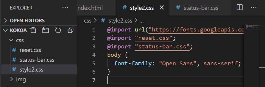
지금까지 작성한 css파일을 status-bar라는 css파일을 새로 만들어서 거따 넣고 원래 css파일로 돌아와서 import시켜주셈
그럼 이제 다시 padding을 직접 줘야겠지?^^...
근데 어떤걸 보고 똑같이 만들때 저 div box크기는 뭘까 padding, margin은 어느정도 줘야 저렇게 되는걸까 싶다면

이거 설치.
Alt+p 누르면 줄자기능 open.
밑에는 태초마을 상태에서 margin이랑 뭐..그런거 다 준 모습.
@import url("https://fonts.googleapis.com/css2?family=Open+Sans:wght@400;600&display=swap");
@import "reset.css";
@import "status-bar.css";
body {
  font-family: "Open Sans", sans-serif;
}

.welcome-header {
  margin: 90px 0px;
  text-align: center;
  display: flex;
  flex-direction: column;
  align-items: center;
}

.welcome-header__title {
  margin-bottom: 40px;
  font-size: 25px;
}

.welcome-header__text {
  width: 60%;
  opacity: 0.7;
}
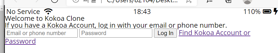
결과
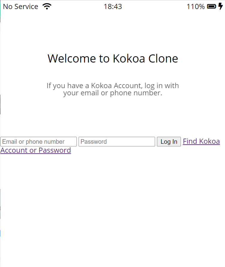
Log In Form part One
style2.css
코드추가
/*로그인창*/

/* id, passwd부분 정렬 */
#login-form {
  display: flex;
  flex-direction: column;
  margin: 0px 30px;
}

/* id,passwd부분 이쁘게 만들기 */
#login-form input {
  border: none;
  padding: 15px 0px;
  font-size: 18px;
  border-bottom: 1px solid rgba(0, 0, 0, 0.2);
  margin-bottom: 25px;
  transition: border-color 0.3s ease-in-out;
}

#login-form input::placeholder {
  color: rgba(0, 0, 0, 0.4);
}

#login-form input:focus {
  border-color: var(--yellow);
}
variables.css
(yellow라는걸 입력하면 수많은 yellow색에서 내가 지정한 yellow색으로 나타나게 변수저장.)
:root {
  --yellow: #fae100;
}
reset.css
/* input부분 클릭할때 테두리(outlint) 안생겼음 좋겠어.*/
input:focus {
  outline: none;
}
모두 적용시킨 결과
.gif)
Log In Form part Two
근데 문제는 저렇게 하면 log in 버튼을 누르면 얘도 밑에 노란색 선이 생긴다는거야.
내가 원했던 건 이게 아니였어.
그럼 login-form input {}에서 border-bottom, transition을 빼고
style2.css
/*input type이 submit이 아닐때만 저 효과 줘라*/
#login-form input:not([type="submit"]) {
  border-bottom: 1px solid rgba(0, 0, 0, 0.2);
  transition: border-color 0.3s ease-in-out;
}
저 코딩 추가.
마우스 디자인 바꾸기
cursor: not-allowed
cursor: progress
cursor: pointer
style2.css
/* submit 스타일링 */

#login-form input[type="submit"] {
  background-color: var(--yellow);
  /*log in버튼에 마우스 올리면 마우스 디자인이 바뀜*/
  cursor: pointer;
  padding: 20px 0px;
  border-radius: 5px;
}

#login-form a {
  text-align: center;
  text-decoration: none;
  /*부모로부터 색을 상속받는거 : inherit*/
  color: inherit;
  font-size: 13px;
}
결과

great!^^
Recap and Forms
<form action="friends.html" method="GET" id="login-form">저렇게 너가 코드 추가하면 log in 버튼 눌렀을때, friends,html이라는 파일로 이동하게돼.
파일을 보내는 방법은 POST, GET 두가지 방법이 있는데 GET은 보안에 취약해
.gif)
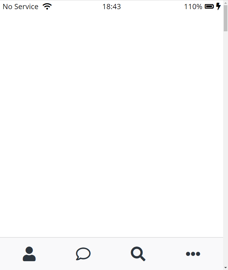
Navigation Bar part One

이걸 만들거야!
이제 friends.html을 할건데
처음부터 다시 시작할 필요는 없어. index.html을 불러와서 복붙하고 필요없는 부분은 없애고 수정하고 그러면돼.
일단 friends도 index랑 위에 상단바가 똑같잖아.
ㅇㅇ 불러와서 저 상단바 부분 코딩만 남기고 다 지워
html을 직접 쓰는 걸 줄여주려고 만든거야 vsc가~~
nav>ul>li*4>a 입력하고 엔터하면

boom! 멋져
또 멋진거
.gif)
글구 우리는 사진중에서 맨 밑에부분에 사람아이콘, 톡 아이콘 이렇게 나열된부분을 먼저 할거야
- html
friends.html
추가 코딩
    <nav class="nav">
      <ul class="nav__list">
        <li class="nav__btn">
          <a class="nav__link" href="friends.html"
            ><i class="fas fa-user fa-lg"></i
          ></a>
        </li>
        <li class="nav__btn">
          <a class="nav__link" href="#"><i class="far fa-comment fa-lg"></i></a>
        </li>
        <li class="nav__btn">
          <a class="nav__link" href="#"><i class="fas fa-search fa-lg"></i></a>
        </li>
        <li class="nav__btn">
          <a class="nav__link" href="#"
            ><i class="fas fa-ellipsis-h fa-lg"></i
          ></a>
        </li>
      </ul>
</nav>- css
nav-bar.css
.nav {
  background-color: #f9f9fa;
  padding: 20px 40px;
}
.nav__list {
  display: flex;
  justify-content: space-between;
}
결과
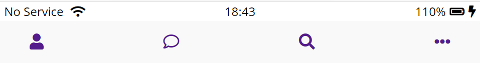
good.
그리고,
@import url("https://fonts.googleapis.com/css2?family=Open+Sans:wght@400;600&display=swap");
@import "reset.css";
@import "variables.css";

/* componets */
@import "components/status-bar.css";
@import "componets/nav-bar.css";

/* screens */
@import "screens/login.css";
이렇게 정리를 하는게 좋은데, 중요한건 variables.css파일을 아래로 옮긴다면,
variable을 사용할 수 없어 아직 import된게 아니니까
Navigation Bar part Two
근데, 아이콘이 작아. 크게 만들자.
fa-2x추가
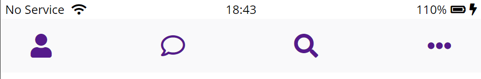
그럼 전에비해 확실히 커졌지?
최종 nav-bar.css
.nav {
    /*스크롤해도 아래에 계속 붙어있도록 하기 */
  position: fixed;
  bottom: 0;
  width: 100%;
  background-color: #f9f9fa;
  padding: 20px 50px;
  /*padding때문에 밀려난 마지막 점3개 아이콘을
  이 코딩 하나로 다 보이게 됐어! */
  box-sizing: border-box;
  border-top: 1px solid rgba(121, 121, 121, 0.3);
}
.nav__list {
  display: flex;
  justify-content: space-between;
}
.nav__link {
  color: #2e363e;
}
reset.css 코딩추가
/* 색깔은 부모에게 상속받도록 하고 링크에 밑줄생기는게 싫으니까 없애자*/
a {
  color: inherit;
  text-decoration: none;
}
최종결과